Introduction
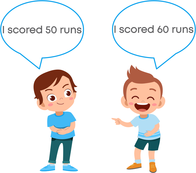
Let us consider 2 data sets.
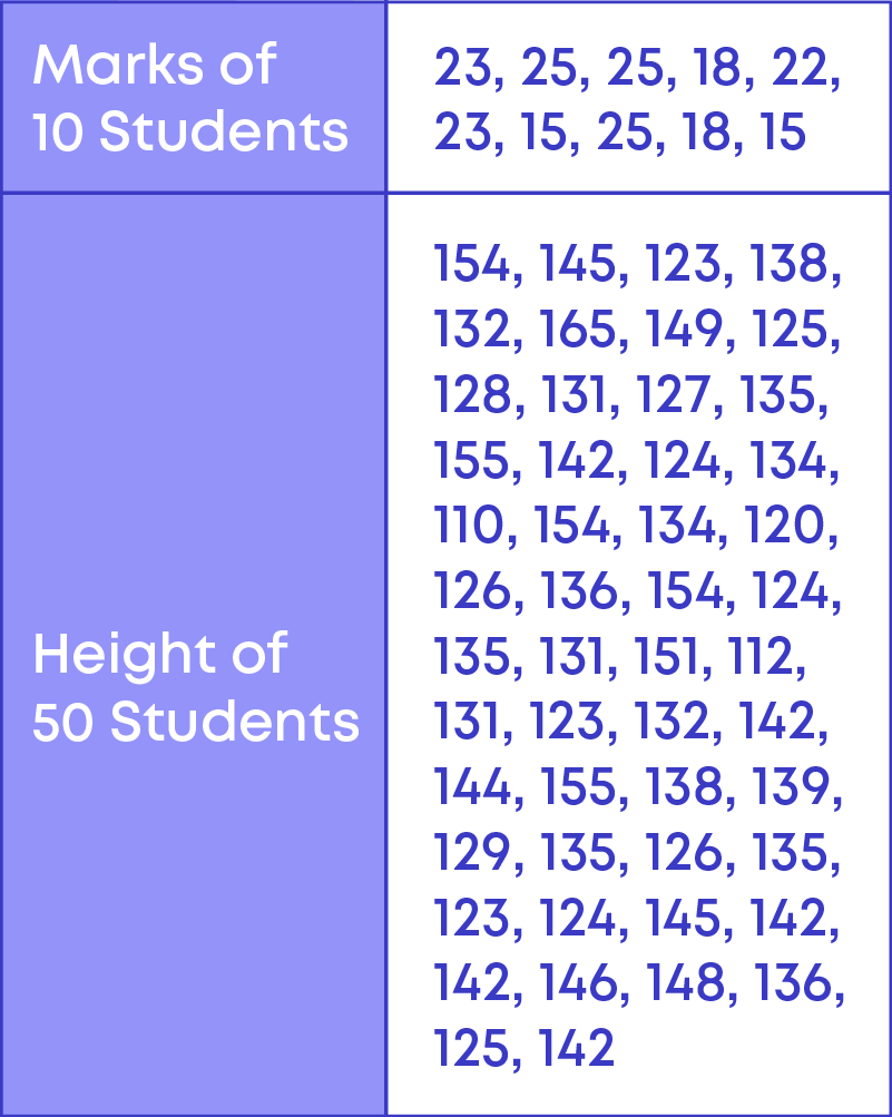
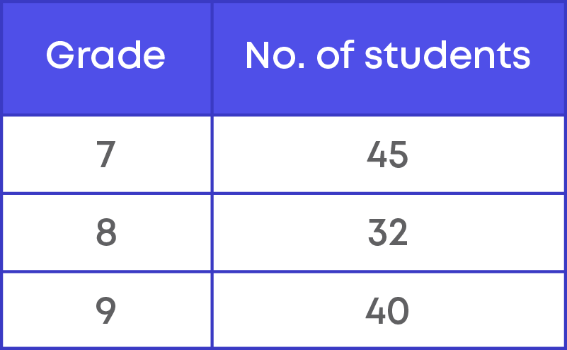
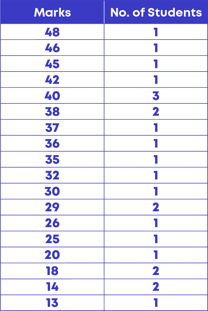
We represent the marks of 10 students in a table as shown here:
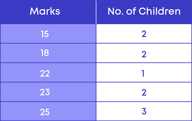
We see here that we have distinct marks and the number of children who scored those distinct marks.
Consider the data of heights. Can we make a table with all the different heights? We can, but it will be very large. The data of the heights is large. We cannot represent it the way we have done marks. We need to use a more easy and efficient way of handling such large data.
There are many situations, where the data set is large. Let us learn how to handle large data efficiently.
So, data is the collection of facts, such as numbers, words, measurements, observations, or description of things. Example: the heights of children in your class.
For data to be useful and meaningful, the items of data must be gathered or captured and recorded in a systematic manner. This is called data handling.
Concepts
The chapter ‘Data Handling’ covers the following concepts:
Handling Large Data
We know how to prepare a frequency distribution table when the data set is small. Now let us consider the data of weights (in kg) of 70 students.
23, 45, 28, 29, 56, 61, 45, 54, 45, 48, 30, 32, 38, 45, 28, 43, 35, 47, 35, 29, 45, 56, 34, 26, 23, 48, 54, 56, 36, 37, 32, 54, 45, 26, 56, 53, 48, 27, 37, 29, 34, 38, 44, 24, 53, 34, 38, 51, 42, 44, 48, 38, 56, 57, 47, 36, 28, 30, 40, 44, 40, 34, 50, 26, 28, 35, 34, 20, 40, 52.
- To prepare a frequency distribution table for the data set, we need to know the range of the data.
- The range of the data determines the number of rows in the frequency distribution table.
The difference between the highest and the lowest observation in a given data is called its range.
We see that the number of observations is 70. The lowest observation is 20 and the highest observation is 61, so the given data set ranges from 20 to 61. That is, the range of the given data set is 61 – 20 = 41
To prepare a frequency distribution table for this data we need to have around 41 rows indicating weight from 20 kg to 61 kg.
It is very time consuming and not an efficient way of making a frequency distribution table. Hence, when the number of observations is large, we group the given observations.
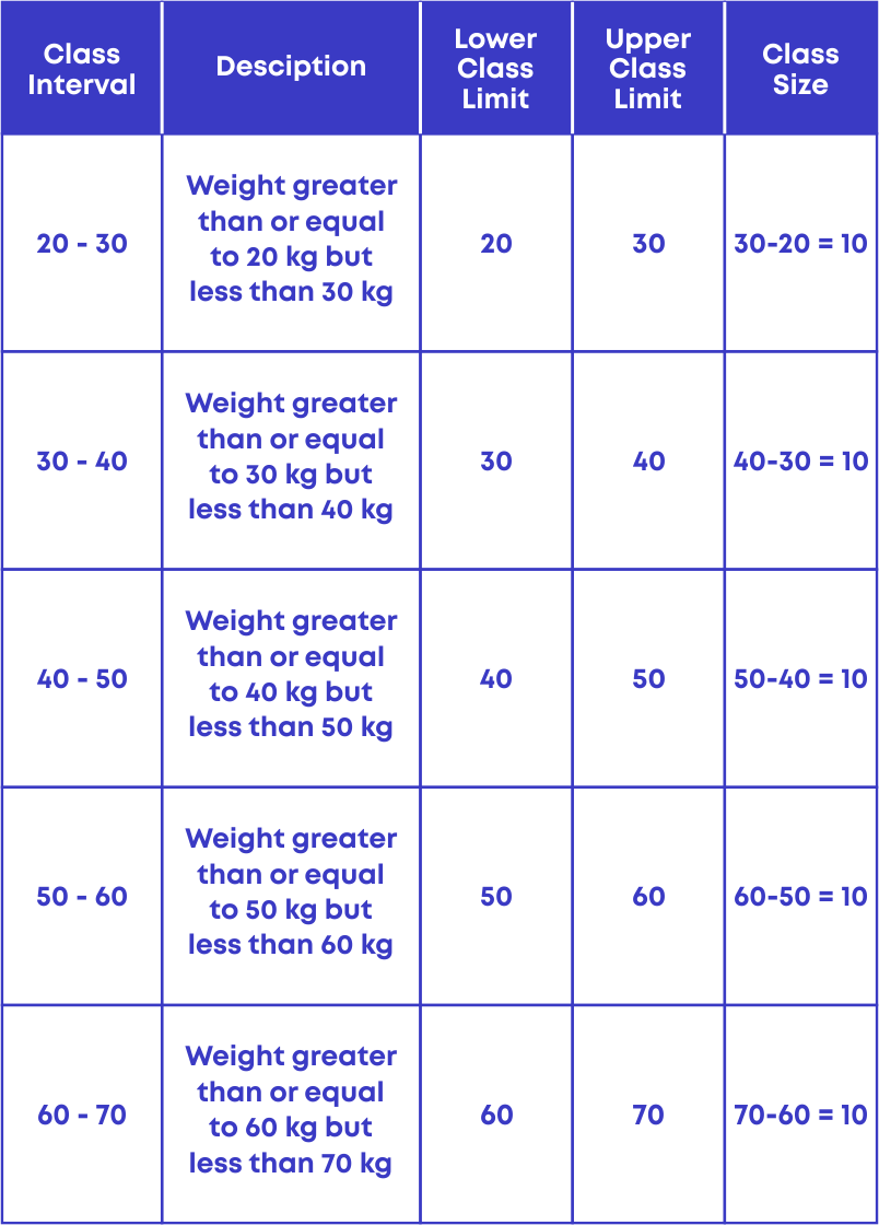
We know that 20 is the lowest observation and 61 is the highest observation, so we should start grouping the observations from 20 to 61 as,
20 – 30, 30 – 40, 40 – 50, 50 – 60 and 60 – 70.
Each of the groups 20 – 30, 30 – 40, 40 – 50, and 50 – 60 are called class intervals.
The following data shows the weights (in kg) of 70 students.
23, 45, 28, 29, 56, 60, 45, 54, 45, 48, 30, 32, 38, 45, 28, 43, 35, 47, 35, 29, 45, 56, 34, 26, 23, 48, 54, 56, 36, 37, 32, 54, 45, 26, 56, 53, 48, 27, 37, 29, 34, 38, 44, 24, 53, 34, 38, 51, 42, 44, 48, 38, 56, 57, 47, 36, 28, 30, 40, 44, 40, 34, 50, 26, 28, 35, 34, 20, 40, 52.
We can group the given observations as 20 – 30, 30 – 40, 40 – 50, 50 – 60 and 60 – 70.
23, 45, 28, 29, 56, 60, 45, 54, 45, 48, 30, 32, 38, 45, 28, 43, 35, 47, 35, 29, 45, 56, 34, 26, 23, 48, 54, 56, 36, 37, 32, 54, 45, 26, 56, 53, 48, 27, 37, 29, 34, 38, 44, 24, 53, 34, 38, 51, 42, 44, 48, 38, 56, 57, 47, 36, 28, 30, 40, 44, 40, 34, 50, 26, 28, 35, 34, 20, 40, 52.
Here we see that 30 is there in 20 – 30 class interval and also in 30 – 40 class intervals.
Is it possible for an observation (e.g., 30) to belong to both the class intervals? No, it is not possible.
To avoid this, by the standard we take the observation 30 to be in the higher class which is the 30 – 40 class interval.
Here, 30 is called the lower class limit, and 40 is called the upper-class limit.
The difference between the upper class limit and the lower class limit is called the width or size of the class interval.
- When the number of observations is large, making a frequency table for all the observations would be long and time-consuming.
- The efficient way is to group the observations and make the frequency distribution table of the grouped data.
A table showing the frequencies of various observations or class intervals of a given data is called the grouped frequency distribution table.
For e.g., the following data shows the weights of 70 students.
32, 45, 28, 29, 56, 60, 45, 54, 45, 48, 30, 32, 38, 45, 28, 43, 35, 47, 35, 29, 45, 56, 34, 26, 23, 48, 54, 56, 36, 37, 32, 54, 45, 26, 56, 53, 48, 27, 37, 29, 34, 38, 44, 24, 53, 34, 38, 51, 42, 44, 48, 38, 56, 57, 47, 36, 28, 30, 40, 44, 40, 34, 50, 26, 28, 35, 34, 20, 40, 52.
The given data can be grouped as 20 – 30, 30 – 40, 40 – 50, 50 – 60 and 60 – 70.
We count the number of observations falling in each of the class interval and form the frequency distribution table for the given data:
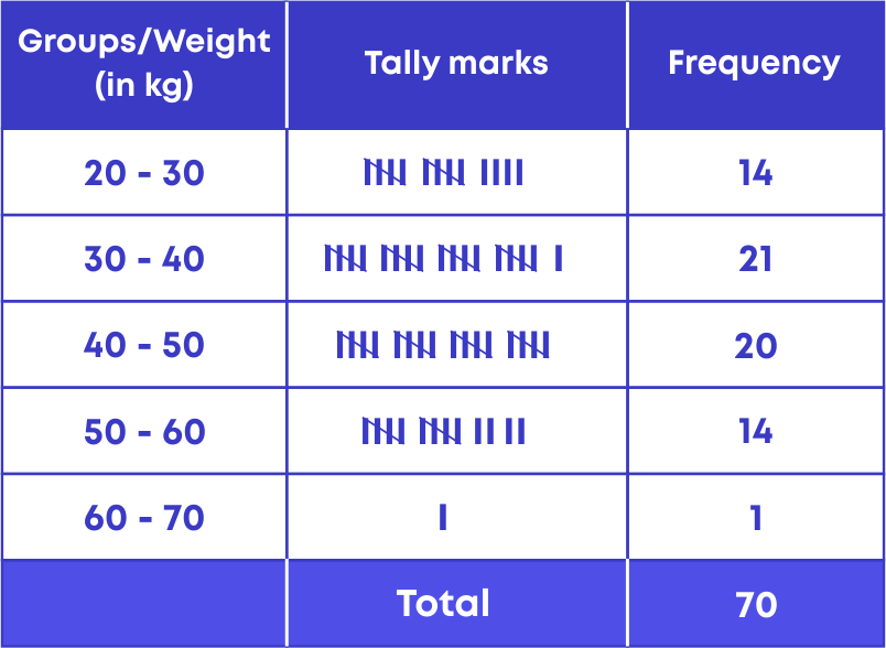
Let us understand how to interpret the given frequency distribution to get the required information.
The following grouped frequency distribution shows the life span of 500 different trees.
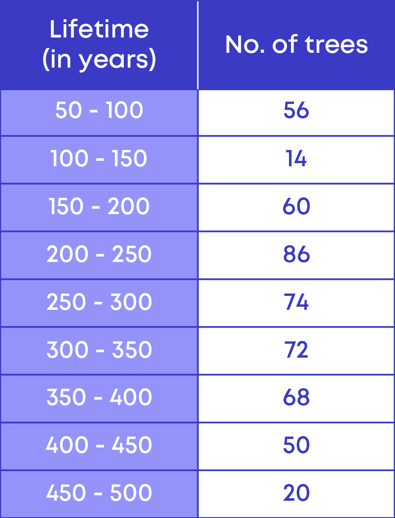
By referring to the given grouped frequency distribution table, let us try to answer the following questions:
How many trees have a lifetime of more than 299 years?
To calculate the number of trees having a lifetime of more than 299 years, we need to add the frequencies of the following class intervals
- 300 – 350
- 350 – 400
- 400 – 450
- 450 – 500
Let us find the number of trees that have a lifetime of more than 299 years.
- 300 – 350: 72 trees
- 350 – 400: 68 trees
- 400 – 450: 50 trees
- 450 – 500: 20 trees
Hence, the total number of trees that have a lifetime of more than 299 years
= 72 + 68 + 50 + 20
= 210 trees
How many trees have a lifetime between 200 to 249 years? From the table, we see that there are 86 trees that have a lifetime between 200 to 249 years.
The frequency of an observation tells us the number of times the observation occurs in the data. To interpret the grouped frequency distribution table, we read the table, that is,
- Analyse the values and their frequency.
- Calculate and get the desired information.
Consider this example:
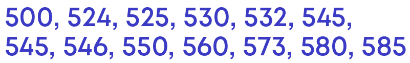
The daily earnings of 30 stationery stores in a market are given below:
715, 650, 685, 550, 573, 530, 610, 525, 742, 680, 736, 524, 500, 585, 723, 545, 532, 560, 580, 545, 625, 630, 645, 700, 735, 546, 642, 640, 665, 710
Let us arrange the data in ascending order:
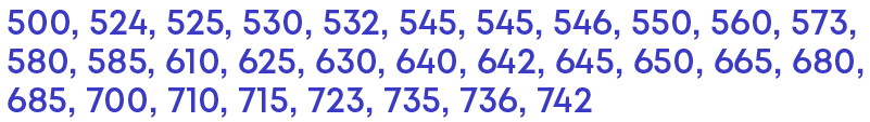
The lowest value is 500 and the highest value is 742. So, the data set ranges from 500 to 742.
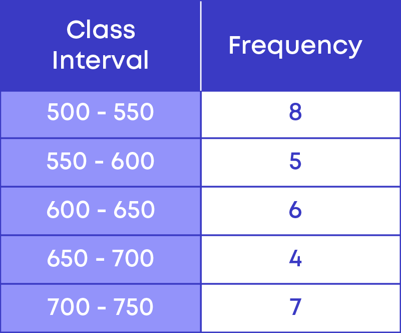
If we take 100 as the class width, then the class intervals will be between
- 500 – 600,
- 600 – 700 and
- 700 – 800.
Let us look at the data set. There are 13 observations falling between 500 – 600 as,
We see that out of the 13 observations, 8 of them fall between 500 – 550.

Since there are more observations falling between 500 – 550, if we take 500 – 600 as the class interval, we will not be able to interpret the given data set to get the proper information. Hence, we need to take the width of the class interval as 50.
We follow three steps to prepare the frequency distribution table for the grouped data.
- Step 1: Identify the class intervals.
- Step 2: Make a table with class interval and frequency.
- Step 3: Record the frequency of observations falling in each group.
Given below is the grouped frequency distribution for the given data:
Things to remember:
- If there are a greater number of observations falling in a smaller range of data, we need to have a smaller width of the class interval.
- If there are a lesser number of observations falling in a smaller range of data, we can increase the width of the class interval.
Data Representation
We know that when the number of observations is large, we group the observation to prepare a grouped frequency distribution.
Now how do we represent the grouped data graphically?
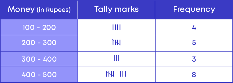
Let us consider the grouped frequency distribution table of the weekly pocket money of 20 students.
This can be represented graphically using a histogram as follows:
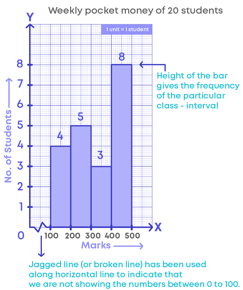
- The horizontal line represents the pocket money (or class intervals).
- The vertical line represents the number of students.
- The scale for the vertical line is 1 unit = 1 student.
- The jagged line (or broken line) on the horizontal line represents that we are not showing the numbers between 0 to 100 or there are no students who get pocket money between 0 to 100.
- The height of the bars give the frequency of the particular class interval also, there is no gap between the bars as there is no gap between the class intervals.
- This graphical representation is called a histogram.
Given below is the data of the marks of 24 students.
20, 14, 48, 37, 38, 29, 30, 14, 18, 46, 45, 40, 40, 36, 25, 13, 18, 26, 35, 38, 32, 40, 29, 42
How do we represent the given data graphically?
- If we use a bar graph, we need to draw 18 bars to present the data, drawing 18 bars is not only time consuming, but also not possible to fit the graph in a graph sheet.
- Hence, we group the data and represent the grouped data graphically using a histogram.
So, a histogram is a graphical representation of a grouped frequency distribution. To interpret a histogram, follow these steps:
- Understand what the graph represents by looking at the horizontal and vertical lines.
- Check the scale of the histogram.
- The height of the bar represents the data for that category.
- Use this information to interpret the histogram.
The four steps to be followed while drawing a histogram are:
- Step 1: Mark a reference point ‘O’ on the graph paper, then from ‘O’ draw a vertical line OY and horizontal line OX.
- Step 2: Mark the class intervals on the horizontal line
- Step 3: Choose a suitable scale for the vertical line.
- Step 4: Draw the bars for the given class intervals.
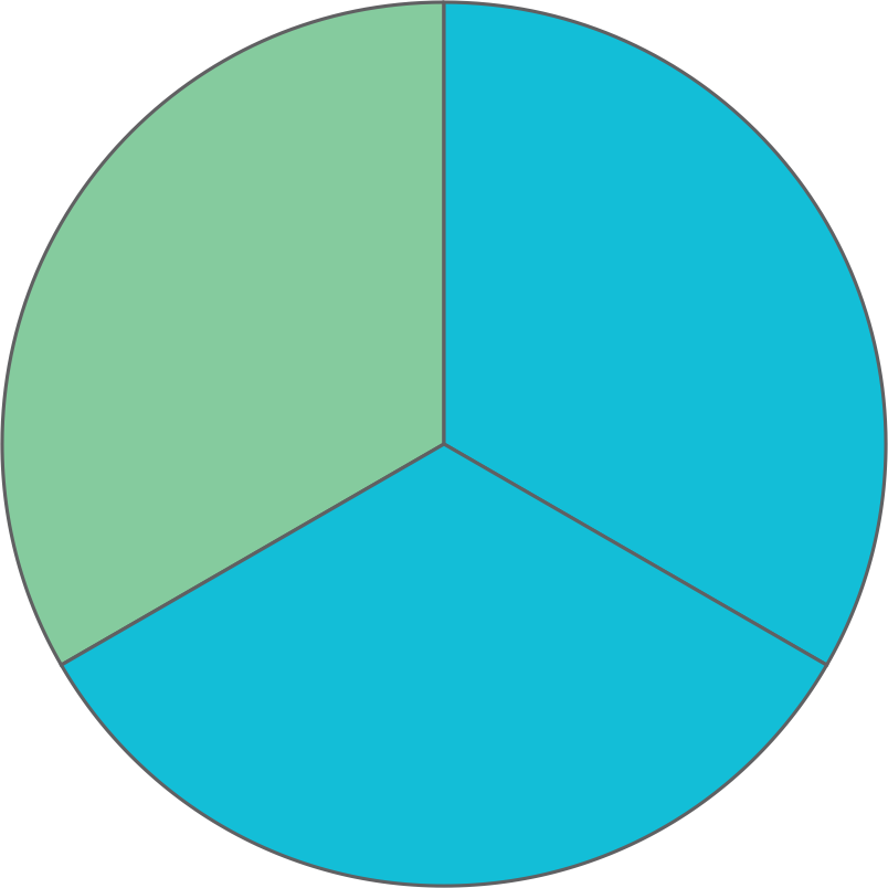
You know that a pie is in the form of a circle. Have you noticed a pie cut into slices? Every slice is a part of the whole pie.
Pie is in the form of a circle. Hence, a slice forms a part of the circle. We can represent the data in the form of a circle, it is called a pie or circle chart.
The representation of data in the form of a circle is called a pie chart. A pie chart shows the relation between the whole and its parts. The entire pie chart looks like a pie and the components in it resemble the slices of the pie.
The following pie chart represents how a child spends time in a day.
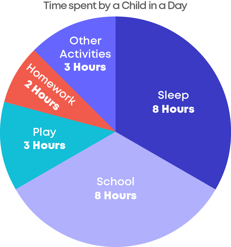
- In this pie chart, we can see that there are 5 slices, these slices are called sectors of the components.
- A circle is divided into sectors corresponding to the fraction of each data component on the whole.
- The given pie chart represents the number of hours a child spends on each activity in an entire day.
- The sectors represent the fraction of the day spent on that particular component(activity).
- The centre of the circle is considered as the central angle and its measure is.
- Each sector corresponding to the data component will be drawn as an angle from the centre hence the sum of central angles of all the components will be 360⁰.
- Generally, pie charts are used to show data in the form of percentages.
To find the value of the component when it is given in percentage, use the following formula:
The value of the component = (Value of the components in percentage ÷ 100) × sum of values of all the components
To find the value of a component when it is given as fraction, use the following formula:
The value of the component = (Value of the components in fraction × sum of values of all the components
Sometimes, we may have a pie chart whose value of components are in the form of angle. Also, we may need to find the sum of values of all the components when the of the values of the components are given as a percentage.
Find the value of the component when it is given in angle form:
Value of the component
= value of all the components in the angle 360 × Sum of the values of all the components
Find the sum of the values of the components when one of the values of the components is given:
Sum of the values of all the components
= 100 value of the component in percentage × value of the component in numbers
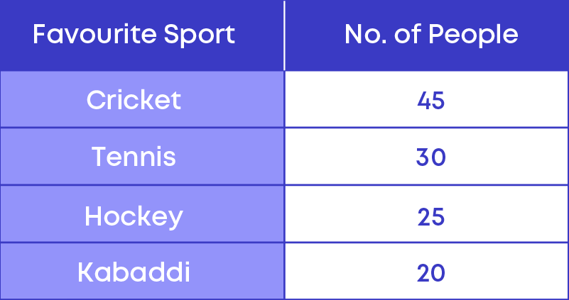
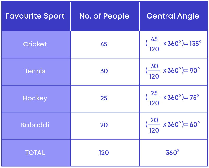
The following table shows the result of a survey conducted to find the favourite sports of the people in a locality.
To represent this using a pie chart, each of the components, cricket, tennis, hockey, and kabaddi should be represented by a sector of a single circle.
- To draw a sector we need to know the central angle for that sector.
- The centre of a circle is a point and the sum of the angles around the point will be 360 degrees.
- Hence, the central angle of the components will be a fraction of 360 degrees.
Now let us calculate the central angles for all the components. The categories are called the components. Here the frequencies are in the form of numbers, hence,
- The central angle of the component
= ( frequency of the component sum of all frequencies × 360)⁰
- The total number of people or sum of all the frequencies
= 45 + 30 + 25 + 20 = 120.
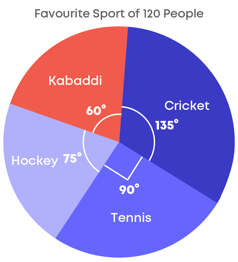
Given below is the pie chart representing the favourite sports of 120 people.
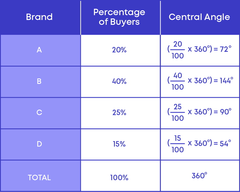
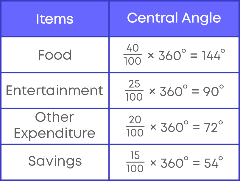
The given table shows the percentage of buyers of 4 different brands of television.
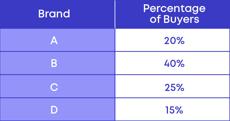
Here we can see that the frequency or the value of the components are given in percentage.
Hence to calculate the central angle we use a different formula that is,
- The central angle of a component
= ( frequency of the component in percentage 100 × 360)⁰
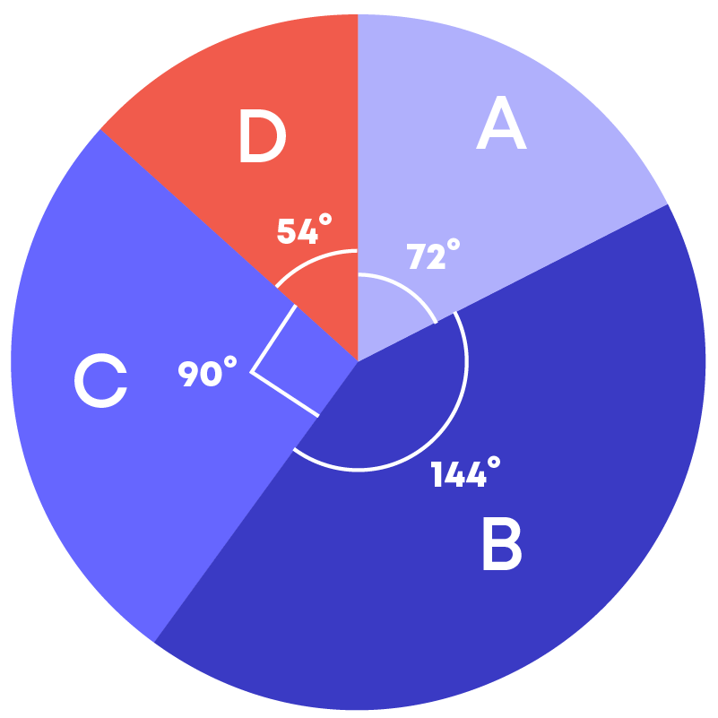
Given below is the pie chart:
To draw a pie chart, follow these steps:
- Step 1: Calculate the central angle:
If the value or frequency of the components are expressed in the form of a percentage, we use the following formula to calculate the central angle,
Central angle of a component
= ( frequency of the component in percentage 100 × 360)⁰
- Step 2: Draw a circle of any convenient radius.
- Step 3: Make the sectors for all the components.
Probability
Rohit and his friends are playing ludo. To start playing, one should roll the number 6 first. Rohit throws a die; can he predict the number the die lands on?
Or, can he get 6 when he wants 6? No, that is not possible. Such an experiment is called a random experiment. Here there are 2 terms, ‘random’ and ‘experiment’.
Let’s understand these terms:
- If you can repeat the same procedure under the same condition, then it is called an experiment.
- Here we can take the same die and keep tossing it, hence it becomes an experiment
- If you cannot predict the result of an experiment, it is called a random experiment.
Random experiment is the one whose outcome cannot be predicted exactly in advance. In other words, the experiment has more than 1 result and we cannot predict the result until the experiment is over.
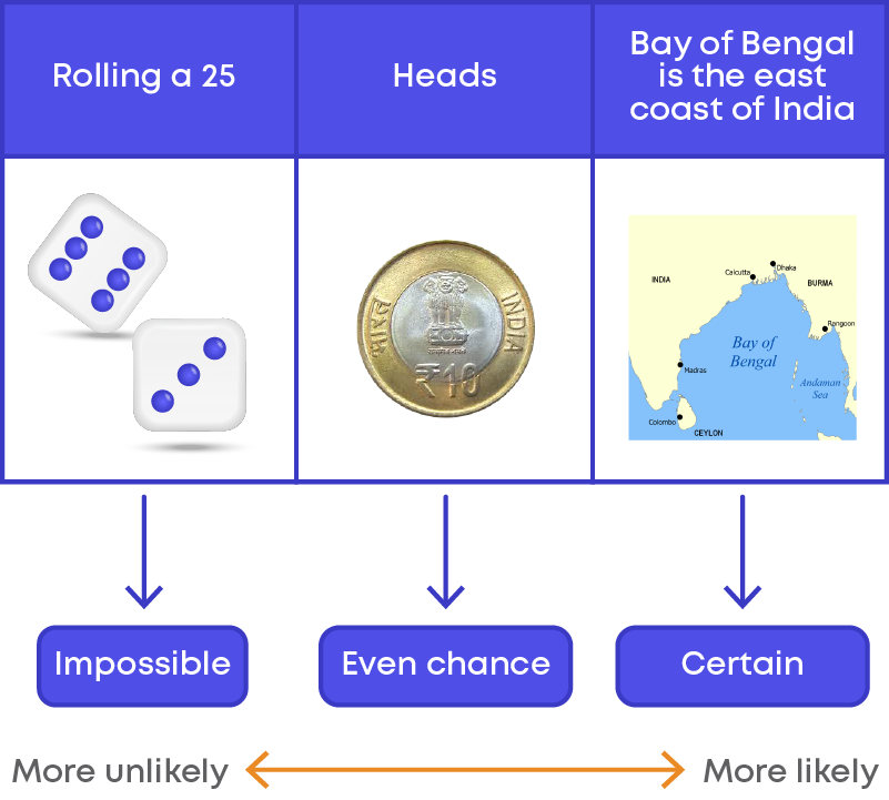
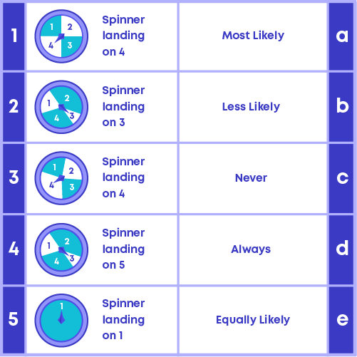
We know that throwing a die is a random experiment; in such a random experiment, we can actually predict the chance of getting possible outcomes. That is, we can predict the chance of occurrence of 1,2,3,4,5, or 6. We call this chance a probability.
Probability is the possibility or chance of something happening or not happening. We represent probability using the letter P.
We know that when you toss a coin, the possible results will be either head or tail. The possible result is called an outcome.
Now suppose, you roll a die. The picture below shows the results.
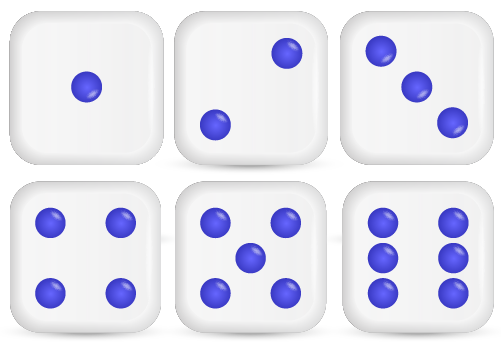
These results are called the possible outcomes of this experiment.
Hence, an outcome is a possible result of an experiment.
- Each outcome of an experiment or a collection of outcomes make an event.
- For example, in the experiment of tossing a coin, getting a ‘head’ is an event and getting a ‘tail’ is also an event.
A favourable outcome is an outcome or result that you are looking for in an experiment.
- When you toss a coin to get a head,
There are only 2 outcomes, head and tail. Here you desire to get a head. So here the favourable outcome is head. Hence, the total number of favourable outcomes is 1.
- When you roll a dice to get an even number
We know that dice has 6 faces hence there are 6 possible outcomes:
1, 2, 3, 4, 5, 6
Here you desire to get an even number. Out of the 6 possible outcomes, only three of them are even numbers. The favourable outcomes are 2, 4, 6. Here, the total number of favourable outcomes is 3.
Raj is rolling a die. Here there are 6 possible outcomes. You can get either 1, 2, 3, 4, 5, or 6.
- Now, what is the chance of getting an odd number?
- What is the chance of getting an even number?
- What is the chance of getting a number less than 5?
Let us list the possible outcomes for each in a table.
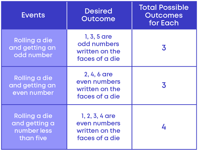
Here we can see that, out of the 3 different events,
- getting an odd number
- getting an even number
have the same chance of occurrence.
Hence, there are called equally likely outcomes.
Equally likely outcomes are those outcomes that have the same chance of occurrence.
If you toss a coin, then the possible outcomes are either head or tail. Hence, the total possible outcomes are 2.
Out of 2 possible outcomes 'head' is the favourable outcome. Hence, favourable outcome is 1. The total number of possible outcomes is 2, out of which the favourable outcome is 1.

Probability of getting a head = 1 2
Similarly, probability of getting a tail = 1 2

So, you see that the chances of each event occurring is equal. But there are some situations where the possible outcomes may not have equal chances of occurring.
There are 4 balls in a bag, out of which 3 of them are blue and 1 of them is red. Let the balls be ball A, ball B, ball C, and ball D.

When you pick a ball, you have a chance of picking any one of the four balls. Here in the bag, there are 4 balls, so there is an equal chance that you might pick either ball A, ball B, ball C, or ball D.
Thus, the total number of possible outcomes will be [ball A, ball B, ball C, ball D], i.e., there are 4 possible outcomes.
If you pick one ball randomly what is the chance of getting a blue ball?
Out of the 4 balls, there are 3 blue balls, so there is an equal chance that you will pick any of the blue balls.
That is, you might pick ball A, ball B, or ball C (which are blue in colour).
Hence, the favourable outcomes will be [ball A, ball B, ball C], that is there are three favourable outcomes.
So, the probability of picking a blue ball will be 3 4.
The probability of picking a blue ball can also be represented as,
P (picking a blue ball) = 3 4
Now, what is the probability of picking a red ball?
We already know that the total number of possible outcomes is 4 but out of 4 balls, there is only 1 red ball. So, we can say that 1 is a favourable outcome.
Hence, the probability of picking a red ball will be 1 4.
Hence, P (picking a red ball) = 1 4

Remember these points:
- The probability of an impossible event is ‘0’
- The probability of a certain event is ‘1’
- Probability ranges from 0 to 1.
Common Errors
The following are topics in which students make common mistakes when dealing with data handling:
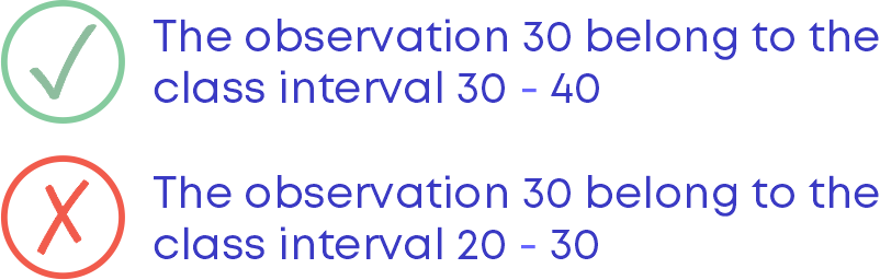
- 1. Where does the observation 30 belong: 20 – 30 or 30 – 40?
- 2. Significance of broken line in Histogram
- 3. No gaps between the bars of a histogram
- 4. Drawing a pie chart
Where Does The Observation 30 Belong: 20 – 30 Or 30 – 40?
While preparing a grouped distribution table remember this:
An observation 30 will not fall under the class interval 20 – 30. It will fall under the class interval 30 – 40.
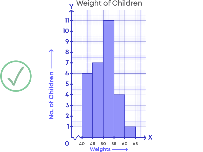
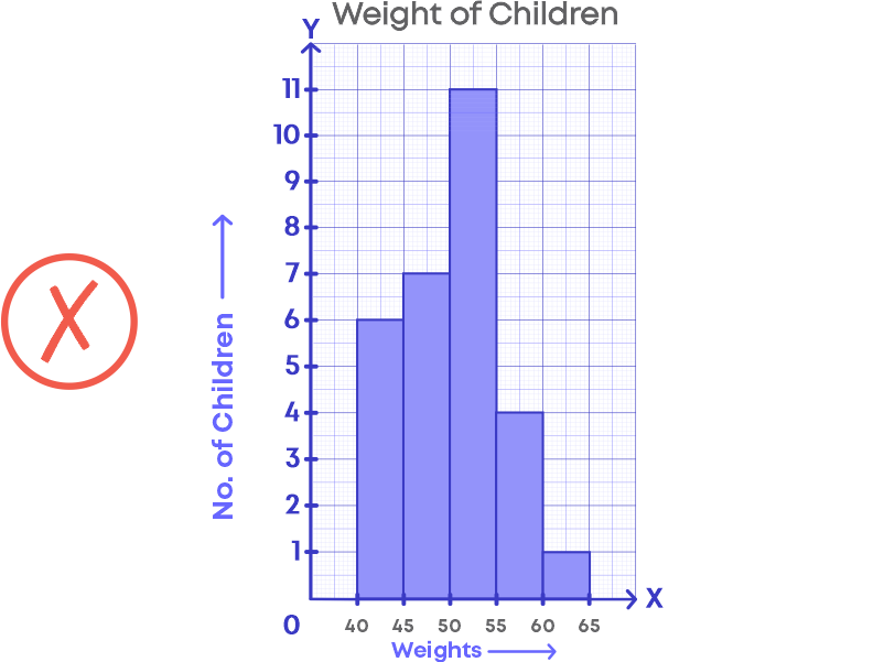
Significance Of Broken Line In Histogram
In a histogram, a broken line should be used along the horizontal line to indicate that we cannot show all the numbers after zero to the lower limit of the first-class interval of the given data.
For e.g., The following graph shows the weights of children.
Here, we are not showing the data between 0 kg to 40 kg. Hence, there should be a broken line along the horizontal line.
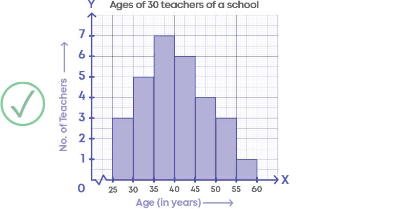
No Gaps Between The Bars Of A Histogram
While drawing a histogram, there should not be any gaps between the bars.
Drawing A Pie Chart
While drawing a pie chart, the first step is to calculate the central angles for all the components. Without calculating the central angle, we will not be able to represent the data in a pie chart. For e.g., the table shows the expenditure of a person.
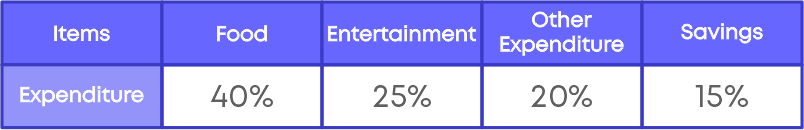
Now to represent the given data in a pie chart, we need to calculate the central angle for all the components.
Conclusion
Now that you can handle data efficiently, try and solve this riddle:
Match the following:

Arpana
Author
Arpana is an education specialist with years of teaching Math and developing content. She previously worked as a freelance content developer, developing lesson plans for a reputed publisher of text books and content for various educational companies. She is an enthusiastic teacher who has taught students from India, the UK, and New Zealand.