Introduction
Let us understand statistics through the video below:
Observations in the form of facts and figures are called data. The process of collecting data, organising them, analysing and representing the information is called statistics.
Observations in the form of facts and figures are called data. The process of collecting data, organising them, analysing and representing the information is called statistics.
It is difficult to analyse large data in its raw form. So, the collected data is represented in tabular form. The graphical representation of data helps analyse it in an easier way.
Statistics also helps in decision-making, scientific discoveries and predicting events such as weather conditions. Further, graphical representation of data helps visualize large datasets at a glance, compare them and observe trends/patterns in the data. So, it is important to learn about statistics.
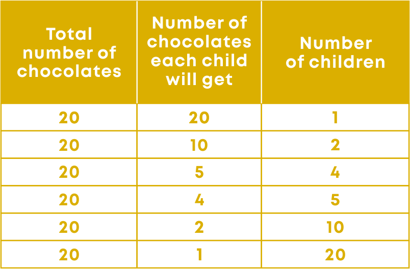
We can represent data using different types of graphs. Now, the question arises on whether we always need to study all the data to interpret it, or if we can make out some important features of it by considering only certain representatives of the data. This is possible by using measures of central tendency or averages.
Concepts
The chapter ‘Statistics’ covers the following concepts:
Data and Statistics
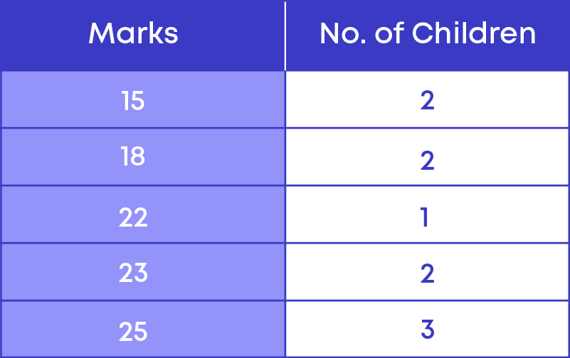
Ram is a representative for grades 7, 8 and 9 in his school. He needs to give information as to how many students are there in each class to organise the seating arrangement for a seminar.
He counted the number of students in each class and represented the information in a tabular form as shown below.
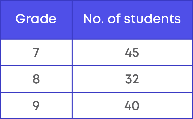
Using the data given by Ram, the seating arrangement can be easily done. Here, we see that Ram collected some numbers or facts that could be used to find the total seating needed. These numbers or facts collected by Ram is called raw data.
What is raw data? Raw data is facts or numbers that are collected from a source. Raw data will not be organised.
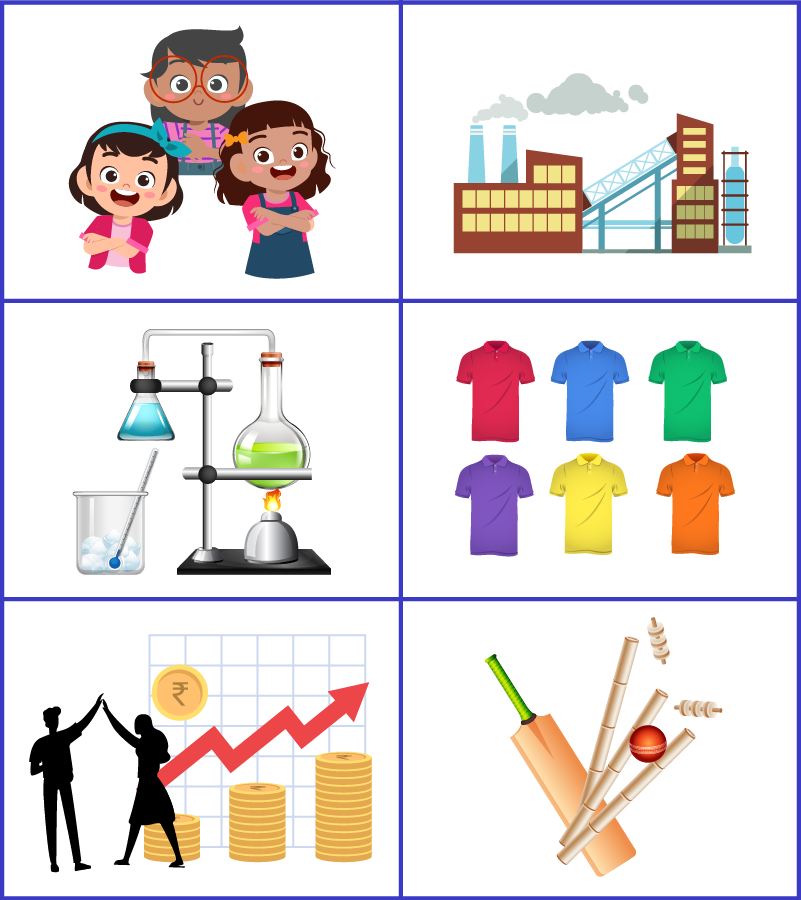
Few examples of data are,
- Scores of different players in a cricket match
- Heights of the children of a class
- Marks scored in different subjects.
- Government expenditure in various sectors in each year,
- Number of votes each candidate received in an election.
- Earnings of a movie for a certain number of days in a month
Thus, facts or figures collected for a definite purpose is called data.
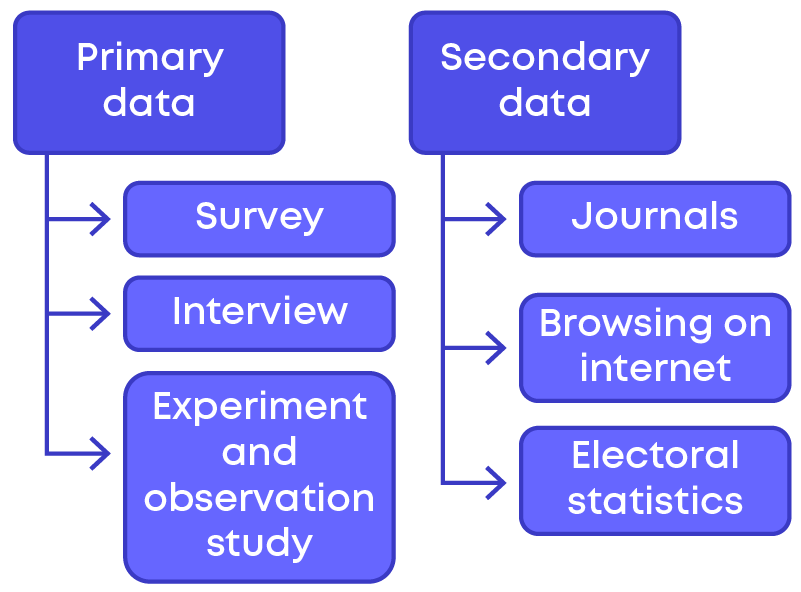
The data collected by the first person or directly by the person who organises the data is called primary data.
(or)
When the information is collected by the investigators themselves with a definite objective in their mind, the data obtained is called primary data. It is also called as raw data.
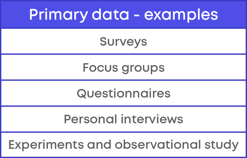
When the data is gathered from a source which already has the information stored, it is called secondary data.
Examples:
- 1. Newspaper
- 2. Journals
- 3. Other books and articles
- 4. Census reports
- 5. Websites
- 6. Government reports
There can be different ways of collecting data.
- 1. We can ask or interview a target group of people for the required information.
- 2. We can collect data from reports available on the internet.
- 3. We can collect data from already published reports, journals, and articles.
Based on the way the data is collected, we have two types of data:
- 1. Primary data
- 2. Secondary data
Data collected can be represented in a table and then in a graphic form. From the graphs, we could interpret and analyse various information.
The process of presenting, interpreting, and analysing data is called statistics.
Examples of using statistics are,
- Businesses use statistics to calculate their performance, compare themselves with the competitors.
- Statistical genetic studies in humans suggest that 40 - 70% of obesity is due to genetics.
- After the elections, the results are explained and analysed by using advanced statistical techniques.
Consider the data given in the table below:
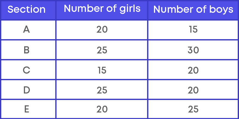
The table shows the number of girls and boys in 5 sections of a class. Data here is organised in a table. Now, let us represent this in a graph.
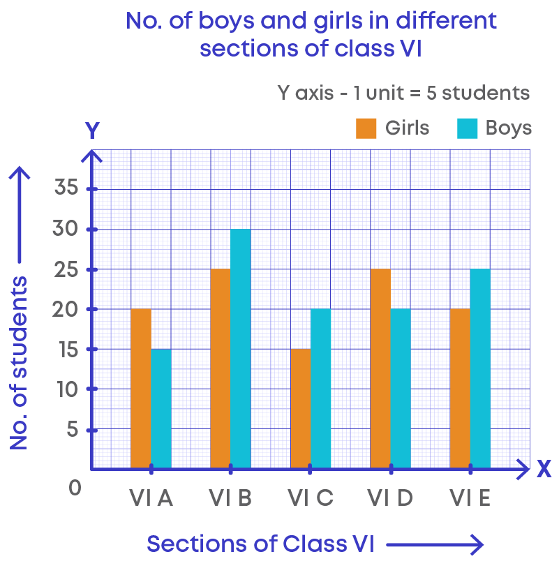
From the graph, we can interpret the following:
- In sections B, C and E, there are more boys than girls.
- There are a total of 35 students each in sections A and C.
From this we can see that, data can be organised in tables and represented using graphs. These help us to interpret and analyse the data very easily.
Presentation of Data
Presentation of Data – Ungrouped Frequency Table
Let us consider the data below:
220, 210, 220, 265, 220, 265, 200, 200, 240, 210, 265, 220, 280, 265, 265, 280, 280, 220, 270, 210, 210, 240, 240, 250, 270, 270, 220, 250, 200, 265
Let us arrange these numbers is ascending order.
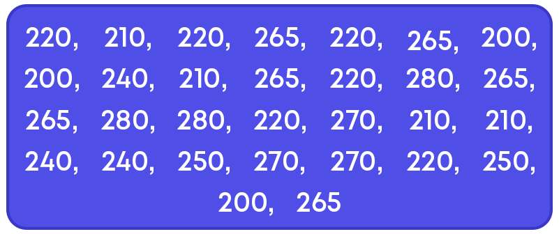
Observe the data. Now, the data is organised better. Can you easily count the frequency of each one? Yes.
So, you see that when data is presented in an organised manner, it is easy to understand and analyse. This is nothing but presentation of data. Presentation of data is very important in statistics.
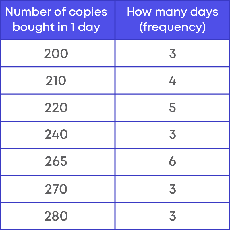
To represent the same data in a table form, we make two columns. Write the data points in the first column. The number of times the data point occurs in the data set or the frequency is written in the second column.

Each number in the first column represents the number of copies sold in a day which is a data point. The number of times each data point occurs is called the frequency.
The data presented in the table form is more organised now and easy to interpret.
Consider the data of the number of copies of a magazine bought.
This data can be represented in a graph as shown below:
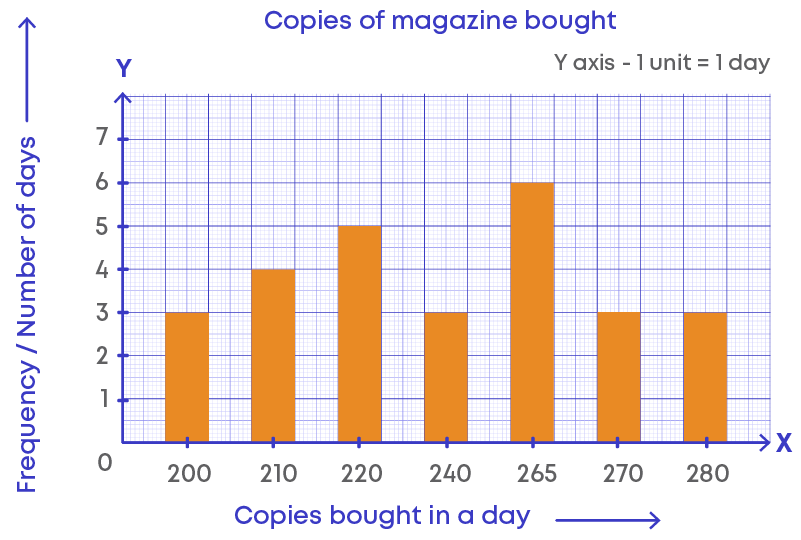
Graphs are another way of presenting data. Graphs help to interpret and analyse data more easily.
Now, let us learn how to prepare a frequency distribution table for ungrouped data through an example.
An organization collected information about the ages of 30 employees in a company.
34, 20, 34, 23, 26, 38, 28, 40, 29, 23, 38, 30, 28, 30, 32, 34, 35, 37, 28, 37, 26, 38, 34, 29, 32, 38, 40, 29, 34, 35.
This is ungrouped data.
Step 1: Let us arrange the data in ascending order.
20, 23, 23, 26, 26, 28, 28, 28, 29, 29, 29, 30, 30, 32, 32, 34, 34, 34, 34, 34, 35, 35, 37, 37, 38, 38, 38, 38, 40, 40.
Note: We arrange data in ascending order because it is easy to organize data in this form.
Step 2: Identify the columns.
Here, the information is about the age of employees. Hence, the columns will be,
- Age
- Number of employees (frequency)
Now let us prepare the frequency distribution table for the given data.
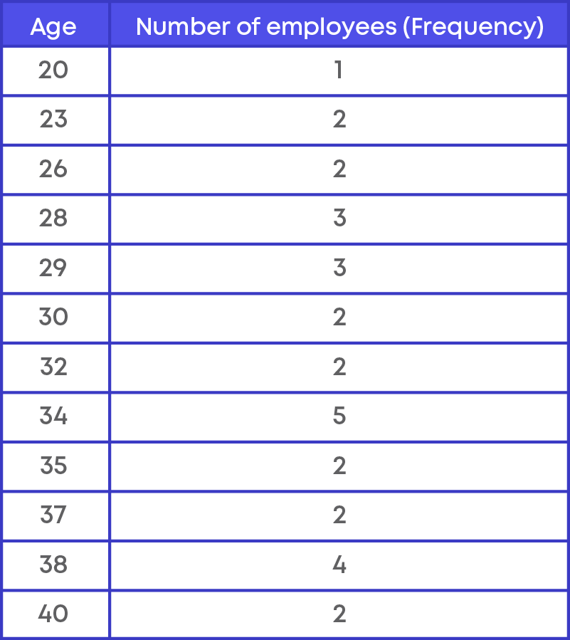
In the frequency table above, we see that each data point is a single number or discrete value. We call such data as ungrouped data and the frequency distribution is called Ungrouped Frequency Distribution. Hence, the table above represents the frequency distribution table for ungrouped data.
Presentation of Data – Grouped Frequency Table
When data is large, it become difficult to represent the data in an ungrouped form. We can group the data to represent it. The example below shows how to prepare a grouped frequency table.
The marks obtained by 30 students in mathematics examination are given below:
58, 52, 45, 41, 27, 23, 58, 49, 45, 32, 26, 22, 56, 47, 43, 28, 25, 10, 56, 47, 41, 28, 24, 10, 55, 47, 41, 28, 23, 3
Step 1: Let us arrange the marks in ascending order.
3, 10, 10, 22, 23, 23, 24, 25, 26, 27, 28, 28, 28, 32, 41, 41, 41, 43, 45, 45, 47, 47, 47, 49, 52, 55, 56, 56, 58, 58.
The minimum mark is 3 and the maximum mark is 58. Here, we see that the data range is big. Representing this as ungrouped frequency will be difficult. Let us try grouping the frequencies.
Step 2: Let us group the frequencies.
Here, the minimum marks are 3 and the maximum marks is 58. We can make groups of equal size as:
1 – 10, 11 – 20, 21 – 30, 31 – 40, 41- 50 and 51 – 60.
The number of values that fall in each group will be the frequency of the group.
Step 3: Prepare the frequency distribution table for grouped data.
In the given data, we find that:
- Between 1 to 10 there are three marks 3, 10 and 10.
- Between 11-20 there are no marks.
- Between 21-30 there are 10 marks 22, 23, 23, 24, 25, 26, 27, 28, 28, 28.
- Between 31-40 there is 1 mark 32.
- Between 41-50 there are 10 marks 41, 41, 41, 43, 45, 45, 47, 47, 47, 49.
- Between 51-60 there are 6 marks 52, 55, 56, 56, 58, 58.
Let us write this in table form:
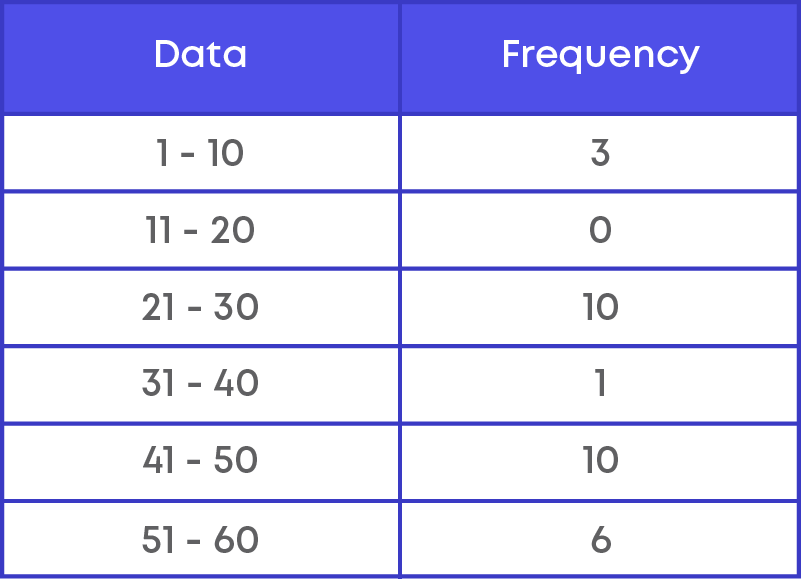
In the table above, we grouped the data and wrote the frequency of each group. Such a frequency distribution where we group data and represent the frequency of each group is a Grouped Frequency Distribution.
Grouped frequency distribution is where the given data is grouped into equal groups and the number of values that occur in a group is its frequency.
We group data when the data range is large and cannot be presented in an ungrouped form.
Let us consider an example and explore important terms which will help us understand what grouped frequency and grouped frequency distribution table is.
Thirty children were asked about the number of hours they watched TV programmes in the previous week and the results are,
8, 4, 8, 5, 1, 6, 2, 5, 3, 12, 3, 10, 4, 12, 2, 8, 15, 1, 6, 17, 5, 8, 2, 3, 9, 6, 7, 8, 14, 12
To present any data, we first need to arrange the data in either ascending or descending order. This makes it easy for us to find the frequency of each data. Arranging the data in ascending order, we have:
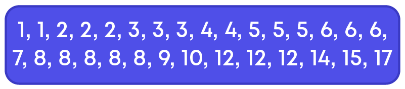
- From this, we can see that the minimum number of hours children watch TV is 1.
- The maximum number of hours is 17.
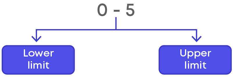
Now, we can group the number of hours as 0 - 5, 5 - 10, 10 - 15, 15 - 20.
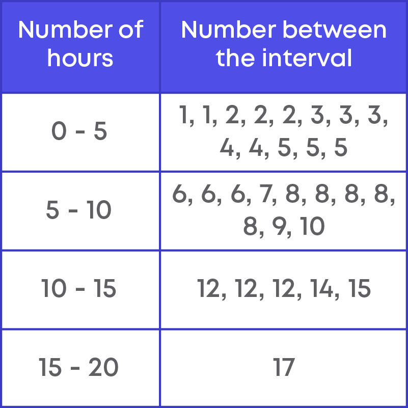
These groups are called ‘Classes’ or ‘Class Intervals.’
We saw that a class interval is written as 10 – 20, 20 – 30, etc. Each class interval is bounded by two numbers, which are called class limits.
The least number of the class interval is called lower limit and the greatest number of the class interval is called the upper limit. So, in the class interval 0 - 5, 0 is called the lower limit and 5 is called the upper limit.
In class interval 5 - 10, 5 is called the lower limit and 10 is called the upper limit.
In class interval 10 - 15, 10 is called the lower limit and 15 is called the upper limit.
In class interval 15 - 20, 15 is called the lower limit and 20 is called the upper limit.
The midpoint of a class interval is called class mark. To find the midpoint of any class interval, we add the lower and the upper limits and divide it by 2.

Consider the following examples:
Class mark of the class interval 0 – 5 = 0+5 2 = 5 2 = 2.5
Class mark of the class interval 5 – 10 = 5+10 2 = 15 2 = 7.5
Class mark of the class interval 10 - 15 = 15+10 2 = 25 2 = 12.5
Class mark of the class interval 15 - 20 = 15+20 2 = 35 2 = 17.5
The difference between the maximum and the minimum value of the given data is called the range.
Thirty children were asked about the number of hours they watched TV programmes in the previous week, the results are,
8, 4, 8, 5, 1, 6, 2, 5, 3, 12, 3, 10, 4, 12, 2, 8, 15, 1, 6, 17, 5, 8, 2, 3, 9, 6, 7, 8, 14, 12
The maximum value is 17 and the minimum value is 1. Thus, the range for number of hours children watch TV is 17 – 1 = 16.
The difference between the upper limit and the lower limit of a class is called class size.

Let us see some examples:
Class size of class 0 - 5 is, 5 – 0 = 5
Class size of class 49 - 59 is 59 – 49 = 10
Class size of class 105 - 109 is 109 – 105 = 4
Let us consider a data set.
₹20, ₹20, ₹25, ₹25, ₹25, ₹30, ₹30, ₹30, ₹30, ₹30, ₹35, ₹35, ₹35, ₹35, ₹40, ₹40, ₹45, ₹45, ₹50, ₹50
How many students get ₹30? To find this, we count the number of times ₹30 occurs in the set. It is 5. The number of times ₹30 appears in the data is called its frequency.
What is frequency?
The frequency of a particular data value is the number of times the data value occurs.
What is the frequency of a class?
The frequency of a class interval is the number of observations that occur in a particular class interval. Example:
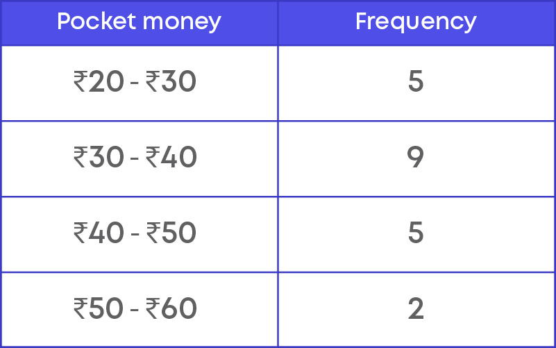
In a class, there are 21 students whose pocket money is given below.
₹20, ₹20, ₹25, ₹25, ₹25, ₹30, ₹30, ₹30, ₹30, ₹30, ₹35, ₹35, ₹35, ₹35, ₹40, ₹40, ₹45, ₹45, ₹45, ₹50, ₹50
Class limits for the given data are ₹20 - ₹30, ₹30 - ₹40, ₹40 - ₹50 and ₹50 - ₹60.
(Note: Do not include upper limit)
Let us understand how to prepare the grouped frequency distribution table using inclusive form by taking an example.
Example: The number of books in different shelves of a library are as follows,
30, 32, 28, 24, 20, 25, 38, 37, 40, 45, 16, 20, 19, 24, 27, 30, 32, 34, 35, 42, 27, 28, 19, 34, 38, 39, 42, 29, 24, 27, 22, 29, 31, 19, 27, 25, 28, 23, 24, 32, 34, 18, 27, 25, 37, 31, 24, 23, 43, 32, 28, 31, 24, 23, 26, 36, 32, 29, 28, 21
We follow the steps below to prepare a grouped frequency distribution table:
Step 1: Identify the minimum and maximum value in the data.
The minimum value in the data is 16. The maximum value in the data is 45.
Step 2: We need to group the data in such a way that the maximum and minimum values are included.
The range of the data = 45 – 16 = 29
If we consider the class size to be 4, then
Number of classes will be 29 ÷ 4, i.e., approximately 7.
Let us group the data as show below.
15 - 19, 20 - 24, 25 - 29, 30 - 34, 35 - 39, 40 - 44, 45 - 49
We need to make sure that the class size is the same for all the class intervals.
Step 3: Identify the frequency of the class intervals.
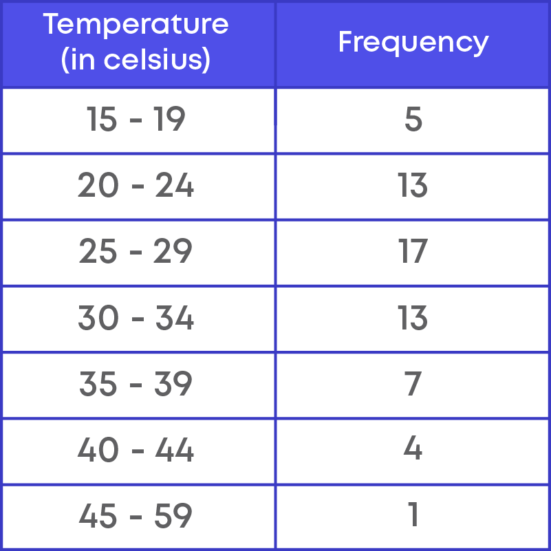
The table above represents the grouped frequency distribution of the given data.
Consider another example:
The marks obtained by 30 students in class 9 in an examination:
3, 12, 15, 17, 25, 28, 24, 25, 29, 30, 38, 35, 37, 36, 39, 40, 48, 45, 47, 48, 48, 47, 48, 25, 28, 35, 34, 39, 45, 42.
The frequency distribution table for the data is,
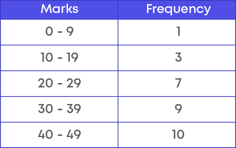
Are the upper limit and the lower limit included to count the frequency? Yes.
Thus, the frequency distribution for which both upper limit and lower limit are included is called inclusive method. How is the class interval grouped – is it continuous?
No, the class intervals are not continuous because the upper limit of a class interval is not the same as the lower limit of the next class interval. So, the inclusive form is also called discontinuous form.
The marks obtained by 30 students in class 9 in an examination are given below:
3, 12, 15, 17, 25, 28, 24, 25, 29, 30, 38, 35, 37, 36, 39, 40, 48, 45, 47, 48, 48, 47, 48, 25, 28, 35, 34, 39, 45, 42.
Let us add the marks of 10 more students from another section.
3, 12, 15, 17, 25, 28, 24, 25, 29, 30, 38, 35, 37, 36, 39, 40, 48, 45, 47, 48, 48, 47, 48, 25, 28, 35, 34, 39, 45, 42, 10, 12, 20, 30, 40, 40, 45, 30, 30, 20.
Let us group the data as 0 - 10, 10 - 20, 20 - 30, 30 - 40, 40 - 50
Frequency of class 10 - 20 is 7.
Frequency of class 20 - 30 is 13.
Here 20 is counted in both the intervals. So, 20 is counted twice.
So, if we exclude the upper limit and calculate the frequency, the count of a particular data can be counted once.
Hence, the frequency distribution table by excluding upper limit is shown below.
The frequency distribution for which upper limit of each class is excluded and lower limit of each class is included is called exclusive method.
Here, the upper limit of a class will be the same as the lower limit of the consecutive class. So, the exclusive form is also called as continuous form.
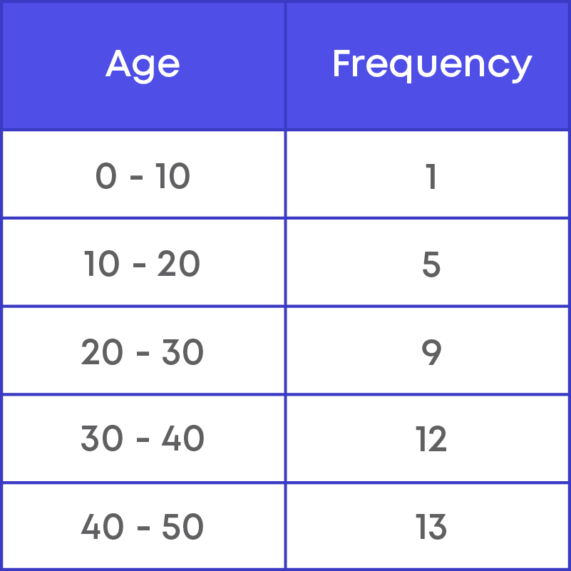
Steps to convert discontinuous intervals to continuous intervals:
Step 1: Consider two consecutive intervals.
Step 2: Find the difference between the upper limit of a class and the lower limit of its succeeding class.
Step 3: Add half of this difference to each of the upper limits and subtract half of this difference from each of the lower limits.
Consider the frequency distribution table for the data.
830, 835, 890, 810, 835, 836, 869, 845, 898, 890, 820, 860, 832, 833, 855, 845, 804, 808, 812, 840, 885, 835, 836, 878, 840, 868, 890, 806, 840, 890, 809, 855.
Let us take two consecutive class intervals, say, 830 - 840 and 840 – 850. Is the upper limit of 830 - 840 same as lower limit of interval 840 - 850? Yes.
Frequency of 830 - 840 is 8.
Frequency of 840 - 850 is 5.
Here, 840 is considered only once in the interval 840 - 850, because 840 is excluded from the previous class.
So, the class intervals are said to be continuous since the upper limit of one class is the lower limit of the following class interval.
Remember! To find the frequency of any class interval, we include numbers equal to or greater than the lower limit, but less than the upper limit.
Consider the data,
830, 835, 890, 810, 835, 836, 869, 845, 898, 890, 820, 860, 832, 833, 855, 845, 804, 808, 812, 840, 885, 835, 836, 878, 840, 868, 890, 806, 840, 890.
Example: The numbers within the class interval 830 - 840 are 830, 832, 833, 835, 835, 835, 836, 836.
Hence, the frequency of 830 - 840 is 8.
Graphical Representation of Data
Presentation of data graphically is more effective compared to other forms of presentation of data. We use bar graphs, histograms, pie graphs, line graphs etc. to represent data. The following figures show different types of graphs to represent data.
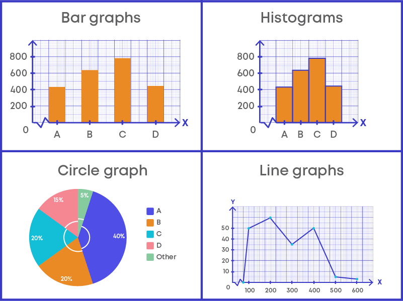
Bar Graph
Bar graphs are mostly used to represent discrete data. To draw a bar graph for any given data, follow the steps below:
- Step 1: Mark a reference point O on the graph paper, then from O draw a vertical line OY and horizontal line OX.
- Step 2: Mark the points on the horizontal line.
- Step 3: Choose a suitable scale.
- Step 4: Determine the heights of each of the bars from the given data and draw the bars.
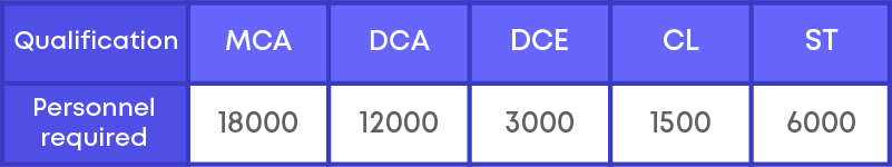
Let us consider an example to understand steps to draw bar graph. The following data gives the qualification and number of employees in a software company.
We need to draw the bar graph for given data. Following the steps above, we get the following graph:
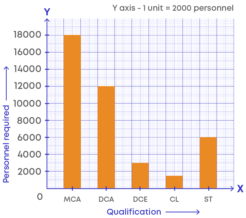
How does bar graph help us? It is a method of representing data visually, hence, we can look at the bars and get information easily. Bar graph summarizes large data set in visual form.
Let us take a bar graph depicting the number of people in an apartment who use different modes of transport.
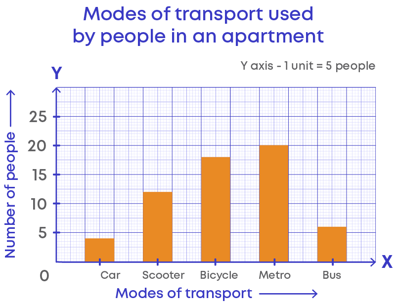
In a bar graph, the title tells us what the graph represents. The graph above represents the number of people in an apartment who use different modes of transport.
The height of the bar represents the frequency of the data value represented by the bar. Here, the scale is 1 unit is equal to 5 people. If the height of the bar is maximum, then it indicates the highest used mode of transportation. If the bar is the shortest, then it represents the least used mode of transportation.
Let us write the frequency of each mode of transport by looking at the graph:

Here, 4 members use car, 12 use scooter, 18 use bicycle, 20 use metro, and 6 use bus as their mode of transportation.
Hence, the total number of people in apartment who use the above modes of transportation is 60.
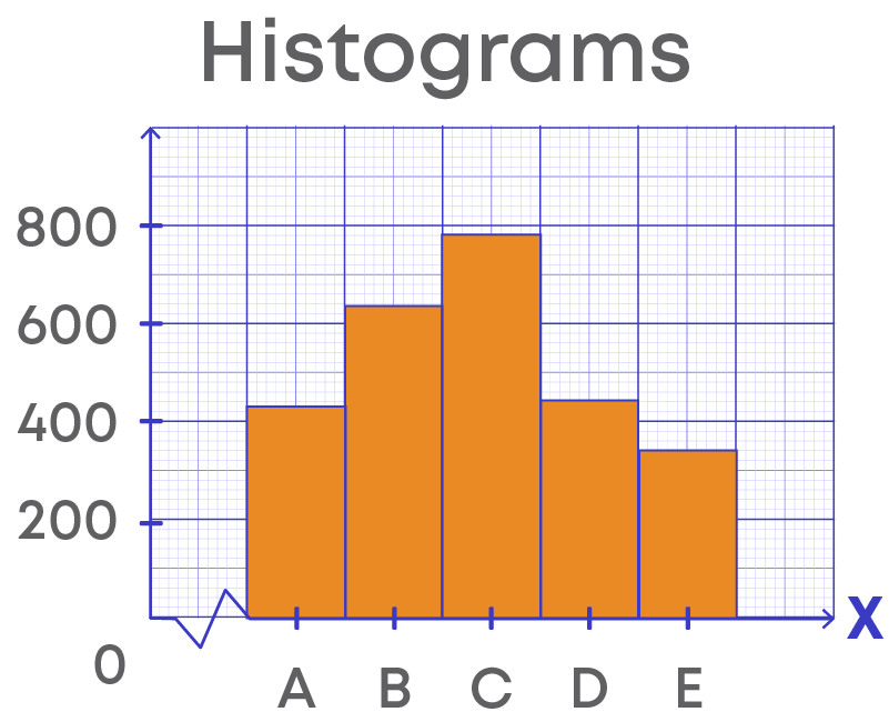
Histogram
We use a graphical representation called histogram to represent grouped data.
What are histograms?
Histograms are graphical representations of a frequency distribution in the form of bars with class intervals along the x-axis and corresponding frequencies as rectangular bars without any gaps between the bars.
How does a histogram look?
Example: Consider the grouped frequency distribution table,
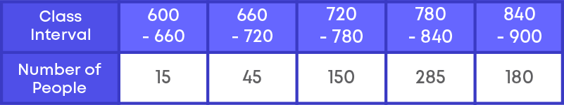
Steps to draw histograms are:
Step 1: Mark a reference point ‘O’ on the graph paper, then from ‘O’ draw a vertical line OY and horizontal line OX.
Step 2: Mark the class intervals on the horizontal line.
We write the lower limit of each class along each point on the x-axis.
That is, we mark 600, 660, 720, 780, 840, 900 along the x-axis.
Step 3: Choose a suitable scale for the vertical axis.
1 unit = 30
Step 4: Draw the bars for corresponding frequencies for the given class intervals.
Since the first-class interval is starting from 600 and not zero, we show this by marking a kink on the x-axis.
Histogram for the data given is,
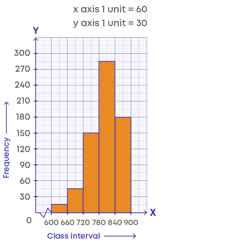
Let us understand the histogram:
- The horizontal line represents the class intervals.
- The vertical line represents the frequency.
- The scale for the vertical line is 1 unit = 30 frequencies.
- The kink (or broken line) on the horizontal line represents that we are not showing the numbers between 0 to 600, or there is no class interval between 0 to 600.
- The height of the bars gives the frequency of the class interval, also, there is no gap between the bars as there is no gap between the class intervals.
- This graphical representation is called histogram.
Now consider this histogram for another grouped data:
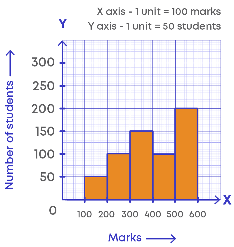
Now let us analyse the histogram.
Which of the class intervals must be considered to calculate the number of students who scored less than 300?
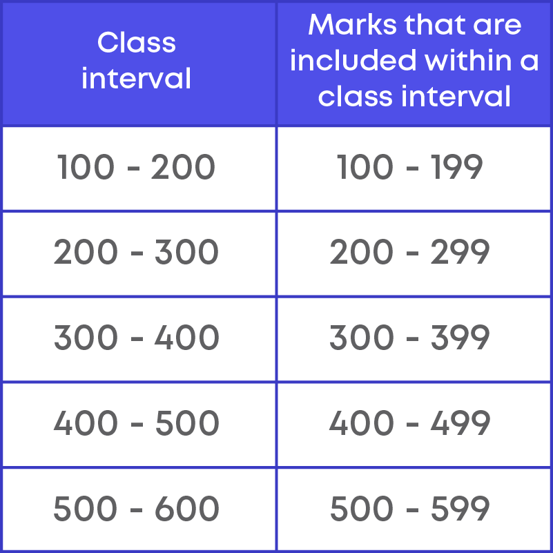
The class intervals 100 - 200 and 200 - 300 must be considered, since
100 - 200 includes the marks from 100 to 199 and 200 - 300 includes the marks from 200 to 299.
Frequency Polygon
We know how to use a histogram to represent grouped data. There is another method of representing grouped data graphically. It is through a frequency polygon.
The following graph depicts a frequency polygon representing grouped frequency distribution.
Let us understand what a frequency polygon is and how we draw it.
What do we call a closed figure made of line segments? They are called as polygon.
How does a frequency polygon look?

Here, in the graph we can observe that a line is drawn joining the midpoint of the frequencies of each class interval. The lines form a polygon where its end points lie on the axes.
If we take out the bars, the frequency polygon looks as given below:
Now let us learn the steps to draw a frequency polygon. We can draw a frequency polygon using two methods:
- 1. With histogram
- 2. Without histogram
Let us consider an example and draw a frequency polygon with histogram.
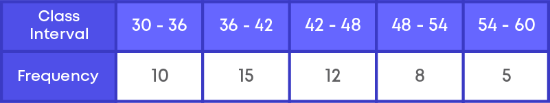
Step 1: First we need to add two more class intervals called as imaginary classes – one at the beginning and one at the end.
The frequency of these classes will be 0.
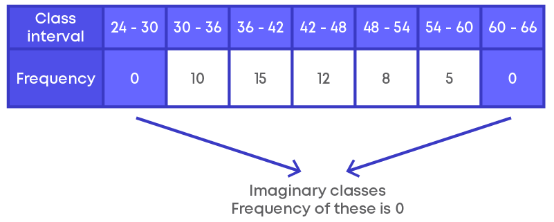
Step 2: Find the mid-point or class-mark of each class interval.
Find the mid-point or the class - marks for the class intervals.
Class – mark = upper limit+lower limit 2
Step 3: Mark the class intervals along the x-axis using suitable scale.
Step 4: Mark the frequencies along the y-axis using suitable scale.
Step 5: Draw the rectangles with class intervals as the bases and respective frequencies as heights.
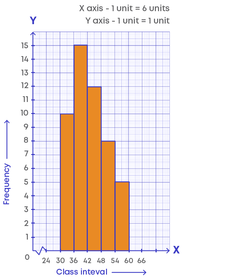
Step 6: Plot the points on the histogram as (class mark, frequency).
Thus, (27, 0), (33, 10), (39, 15), (45, 12), (51, 8), (57, 5), (63, 0).
Joining the points, we get the required frequency polygon.
The lines joining the mid-points of each class forms the frequency polygon.
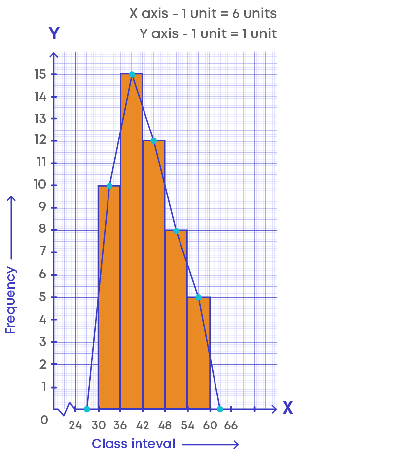
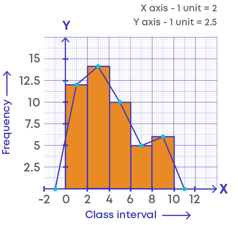
We learnt how to draw frequency polygon with histogram by adding the class interval in the beginning and at the end of the intervals. Now, if there is no class preceding the first class how do we complete the polygon? We need to extend the horizontal axis to negative direction.
Let us understand this using an example.
Consider the frequency distribution table and draw the frequency polygon with histogram.
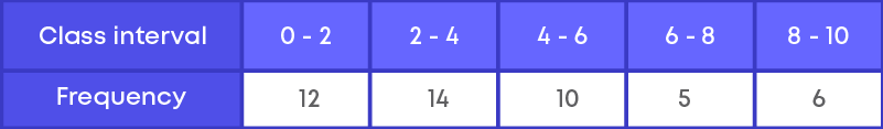
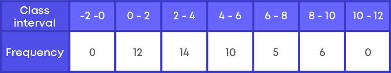
Step 1: First, we need to add two more class intervals called imaginary classes.
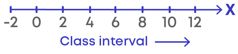
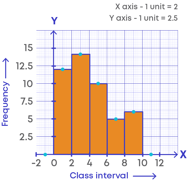
Since the starting point of positive direction of x-axis is 0, to find the preceding interval we extend the x-axis to negative direction and imagine the interval as (-2) – 0. The class interval at the end is 10 - 12. The frequency of the added intervals is 0.
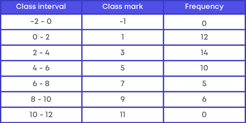
Step 2: Calculate the mid-points or class - marks for the given class intervals.
Class marks = upper limit+lower limit 2
Step 3: Mark the class intervals along the x-axis with suitable scale.
Step 4: Mark the frequencies along the y-axis on suitable scale.
Step 5: Construct the rectangles with class intervals as the bases and respective frequencies as heights.
Step 6: Plot the points on the histogram as (class mark, frequency)
Thus, (-1, 0), (1, 12), (3, 14), (5, 10), (7, 5), (9, 6), (11, 0) are the points.
Joining the points, we get the required frequency polygon.
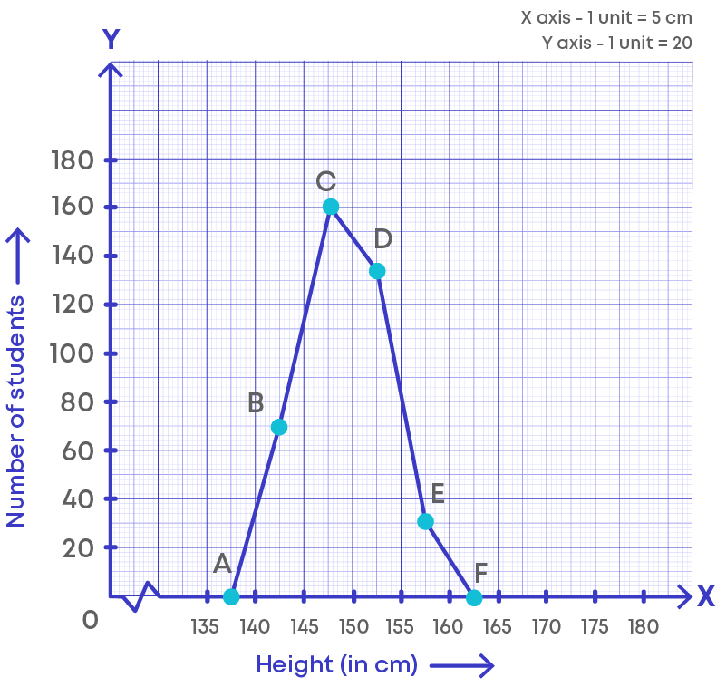
Is it possible to draw the frequency polygon without using a histogram? Yes, it is possible. How do we draw the frequency polygon without a histogram?
Let us find out how to draw this using an example.
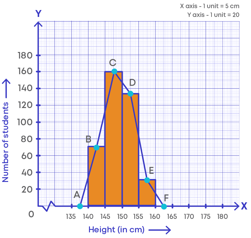
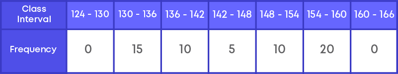
The heights of 60 students in a school are given below.
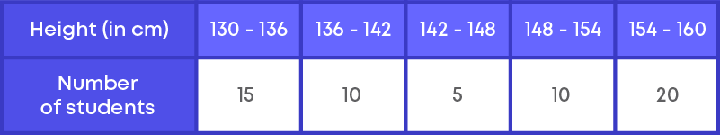
Step 1: First, we need to add two more class intervals called as imaginary classes,
where one class interval is taken at the beginning and the other class interval at the end with frequency 0.
Step 2: Calculate the class marks for the class intervals.
Class marks = upper limit+lower limit 2
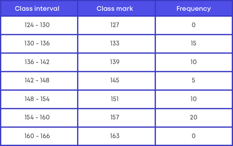
Step 3: Plot the points as (class mark, frequency)
Thus, A(127, 0), B(133, 15), C(139, 10), D(145, 5), E(151, 10), F(157, 20), G(163, 0)
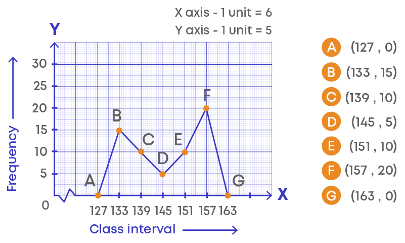
Joining the points, we get the required frequency polygon ABCDEFG.
Let us understand the frequency polygon:
- The horizontal line represents the class intervals.
- The vertical line represents the frequency.
- The scale for the vertical line is 1 unit = 2 frequencies.
- The kink (or broken line) on the horizontal line represents the absence of numbers between 0 to 1 as there is no class interval between 0 to 1.
- The points on the graphs represent the class marks (midpoint) of the given class intervals.
- The points are joined using the line segments.
- A polygon is drawn by joining the points.
- This graphical representation is called frequency polygon.
Frequency polygon is mainly used to compare the data with different frequencies. Consider the distribution of students of two sections according to the marks obtained by them.
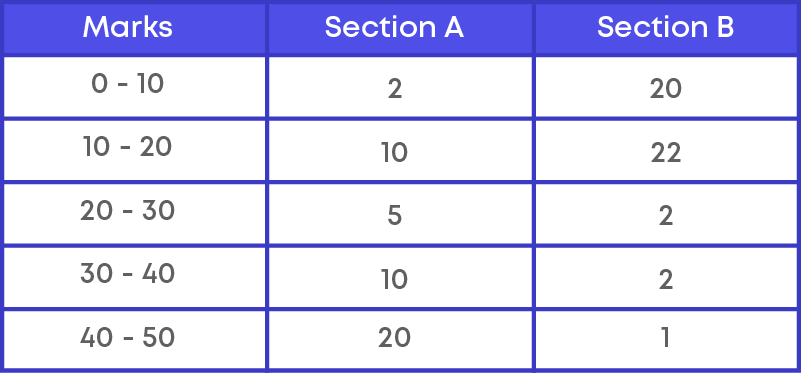
Now we need to represent the marks of the students of the two sections on the same graph using a frequency polygon.
Step 1: First we need to add two more class intervals called as imaginary classes,
where one class interval is taken at the beginning and the other class interval at the end with frequency 0.
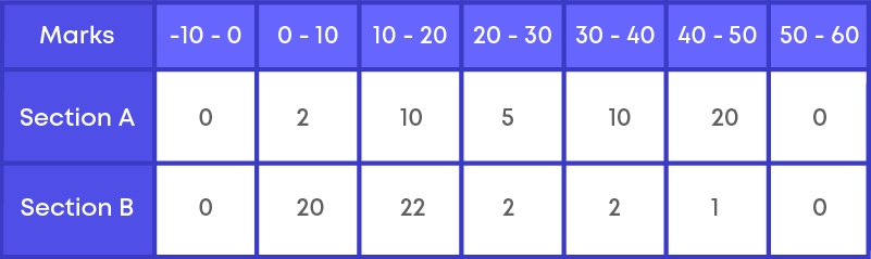
Step 2: Calculate the class marks for the class intervals.
Class marks = upper limit+lower limit 2
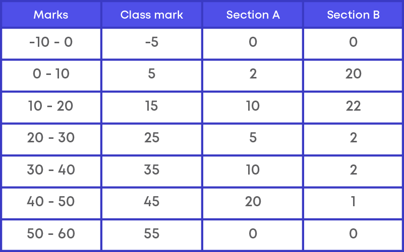
Step 3: We need to plot the points for two frequencies as (class mark, section A) and (class mark, section B)
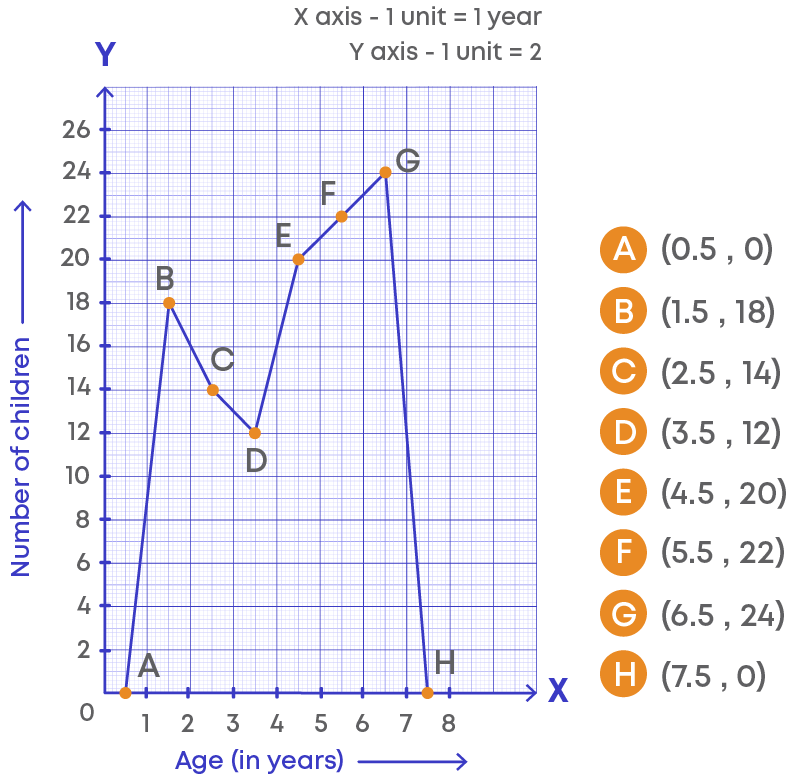
Thus, A(-5, 0), B(5,2), C(15, 10), D(25, 5), E(35, 10), F(45, 20), G(55, 0) and
P(-5, 0), Q(5, 20), R(15, 22), S(25, 2), T(35, 2), U(45, 1), V(55, 0)
Joining the points, we get the required frequency polygon ABCDEFGH and PQRSTUV.
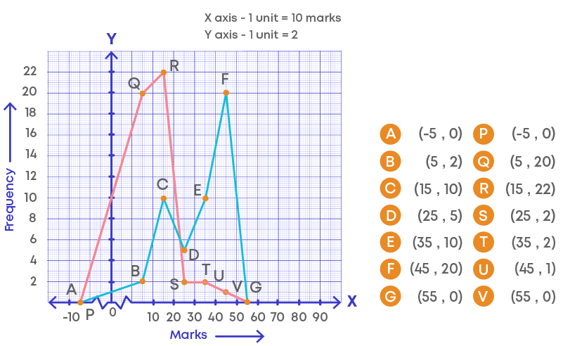
Upon comparing the frequency polygons, we can conclude that the performance of section A is better when compared to section B.
Measures of Central Tendency
Mean
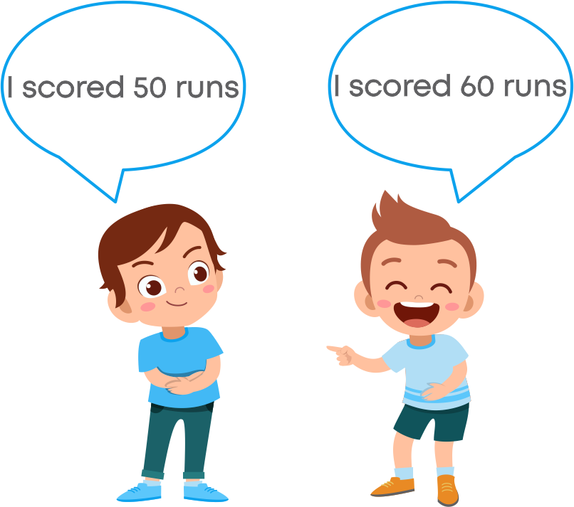
Abhay and Rahul get into an argument as to who the greatest batsman is, Kohli or Dhoni? To find who is the greatest batsman, they need to find the total number of runs and number of matches played by the batsman.
The following table shows the number of matches played and total runs:
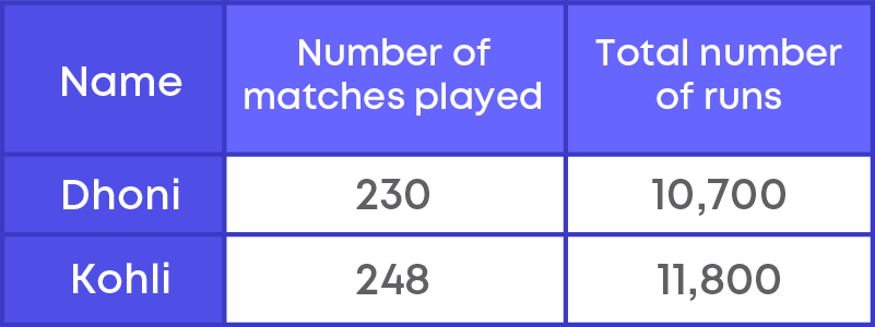
Here, we see that Virat has the maximum runs, and he played 248 matches. Dhoni has lesser total runs than Virat, and he played 230 matches.
To know the best batsman, here they need to find the runs per match. This is nothing but average or the mean runs.
In the example, we found the average of the first six multiples of 5. This average is also known as arithmetic mean.
For example, in the early morning while reading a newspaper, have you observed the daily temperature reports? Well, the temperature varies all day, yet we are given a single temperature that indicates the condition for the entire day. That is the average temperature of a day.
Consider the data of five people who were asked to note how many glasses of water they drink in one day. They said 5, 7, 9, 3 and 6. Let us denote each person as x1, x2, and so on, that is,
x1 drinks 5 glasses of water.
x2 drinks 7 glasses of water.
x3 drinks 9 glasses of water.
x4 drinks 3 glasses of water.
x5 drinks 6 glasses of water.
The arithmetic mean is denoted as x.
Thus, mean of the given data is x = (x1+x2+x3+x4+x5) 5 = 5+7+9+3+6 5 = 30 5 = 6
x = 6
Here, x1, x2, x3, x4, x5 can be represented as 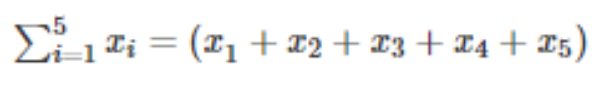

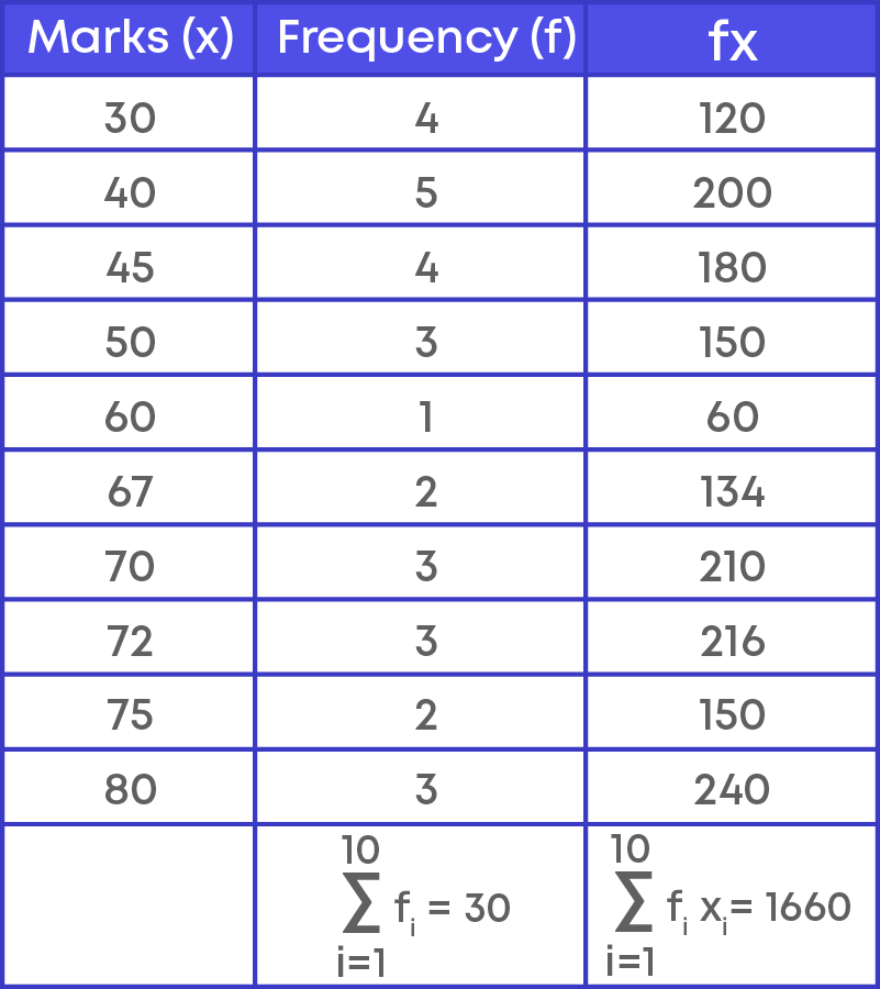
Now let us consider the marks of 30 students, say:
40, 50, 30, 60, 67, 70, 72, 75, 80, 45, 40, 50, 40, 30, 40, 30, 45, 40, 30, 67, 70, 70, 72, 45, 80, 75, 45, 80, 72, 50.
Let us create the frequency distribution table for the given data. Marks are recorded in the first column, and frequency is recorded in the second column of the table.
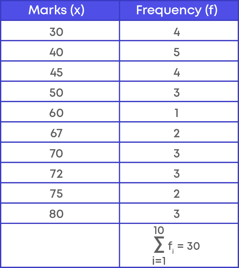
To find the mean of the data, we need to first calculate the total marks obtained by all the students. How many students scored 30? 4
So, the total marks are 30 × 4 = 120
Similarly, we must calculate the total marks for each category. That is,
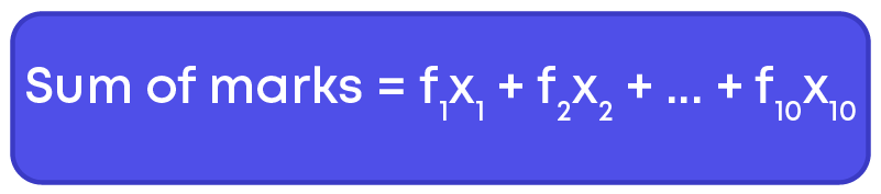
Sum of marks = (30 × 4) + (40 × 5) + (50 × 3) + (60 × 1) + (67 × 2) + (70 × 3) + (72 × 3) + (75 × 2) + (80 × 3) + (45 × 4)
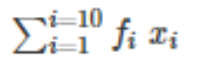
What do you observe? For each category, we need to multiply the marks by the frequency. Let us denote the marks as ‘x’ and the frequency by ‘f’.
How do we write this in summation form?
Let us solve problems based on the mean of a set of data. To solve real-life problems on mean we can use the following steps:
Step 1: Read through the problem carefully.
Step 2: Write down the details given in the question and think through what is being asked.
Step 3: Apply the formula of arithmetic mean to solve the question.
Median
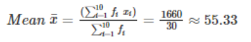
Suppose there are a group of people at your house, and you wish to play a TV channel which will entertain the maximum number of people. The ages of the people are 8, 6, 6, 10 and 85 years. How do you find the channel which a majority of the people will be interested in? Here, you decide to find the mean age.
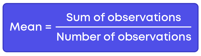
Arithmetic mean = Sum of all observations ÷ Total number of observations
Mean age = 8 + 6 + 6 + 10 + 85 = 115 ÷ 5 = 23
You get the mean age as 23 years. So, you decide to play a movie which would appeal to an audience aged around 23 years.
Now, look at the scenario again, there are four kids and one senior citizen in the group and the mean age, 23 years, is approximately equal to that of a college graduate. Does the mean represent the group well? Will the kids enjoy the movie? Probably not. Will the senior citizens be interested? It is unlikely. In this case, the mean is not a good representation of the central tendency. Now, let us find the median age. To find the median age, we must arrange the ages in ascending order:
6, 6, 8, 10, 85
Median age = 8 years
It has 5 values and the one in the middle, that is 8, will be the median age, as it falls exactly in the middle with two values on its right and two on its left. So, the median gives us a far better representation of the age of the people of this group.
Now, you realize that Cartoon Network is more suited for the majority of the audience. There is also a very good possibility that the senior citizen also enjoys cartoons.
This is one such example where the median is a better representation of a data set than the mean.
When the given data is arranged in ascending or descending order, then the middlemost observation is the median of the data, or we can say that the median is the middlemost number in the set. The median is the middle point of a number set, in which half the numbers are to the left of the median and half are to its right.
The median is the value of the given number of observations, which divides it into exactly two parts.
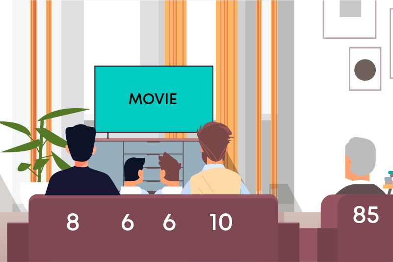
The data below shows the pocket money of five friends.
15, 20, 25, 30, 45.
Let us find the median of this data by following the steps given below:
Steps to find the median of given data:
Step 1: Arrange the data in ascending or descending order.
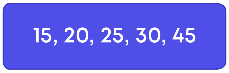
Step 2: Find the median.
Let n be the total number of observations.
If n is odd,
Median = ( n+1 2 )th observation
Here, n = 5 is odd.
n+1 2 = 5+1 2 = 6 2 = 3
Thus, median = 3rd observation
Hence, the median of the given data is 25.
The runs scored by 10 members of a cricket team are as follows:
25, 50, 45, 12, 8, 0, 77, 62, 2, 6.
Let us find the median of this data by following the steps given below:
Steps to find the median of given data:
Step 1: Arrange the data in ascending or descending order.
0, 2, 6, 8, 12, 25, 45, 50, 62, 77
Step 2: Find the median.
Let n be the total number of observations.
If n is even, median = mean of ( n 2 )th and ( n 2 + 1)th observation.
Here, n = 10 is even.
So,
median = mean of 10 2 th observation and ( 10 2 + 1)th observation
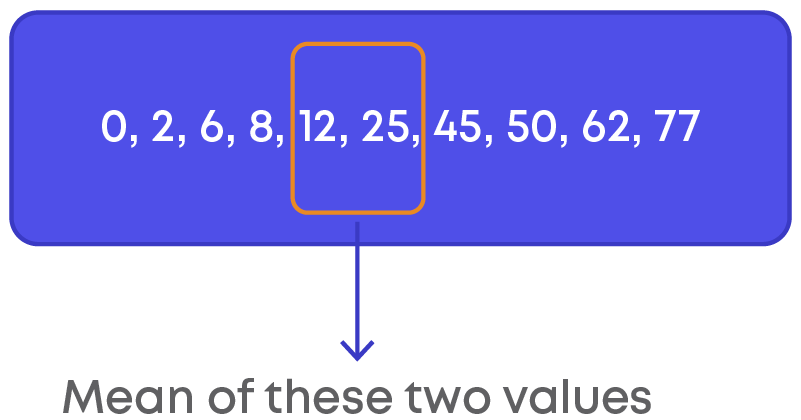
Median = mean of 5th observation and 6th observation.
= ( 1 2 )12 + ( 1 2 )25
= 1 2 (12 + 25) = ( 1 2 )37 = 18.5
If we observe the data, 18.5 does not exist in the data, however, it is the midpoint of the given data. Hence, median obtained need not necessarily appear in the data set.
Consider the data 2, 4, 6, 2x, 10, 12 which is arranged in ascending order with median 7. How can we find the value of ‘x’?
We can apply the formula of median for the given data and find the value of ‘x’. Number of observations is 6 which is even.
Median = mean of ( n 2 )th and ( n 2 + 1)th observation.
= mean of ( 6 2 )th and ( 6 2 + 1)th observation.
= 1 2 3rd observation+4th observation
= 1 2 (6 + 2x)
It is given that median is 7.
So, we have,
7 = 1 2 (6 + 2x)
7 = 3 + x
x = 7 – 3 = 4
Thus, the value of ‘x’ is 4.
To solve problems based on median we can use the following steps:
Step 1: Read through the problem carefully.
Step 2: Write down the details given in the question and think through what is being asked.
Step 3: Apply the formula of median to solve the problem.
Mode
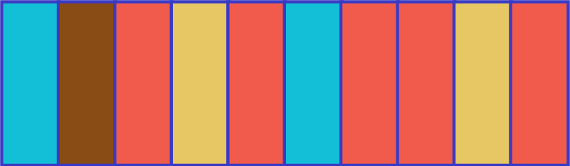
The table explains the frequency of colours.
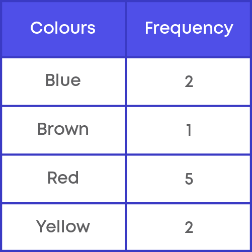
Which colour has the highest frequency? Red. This means red occurs the greatest number of times in the blocks. Hence, the highest frequency will be the mode of any data set.
Consider this data:
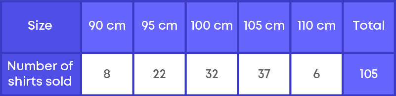
If a shopkeeper had found the mean number of shirts sold, do you think that he would be able to decide which shirt sizes he has to keep in stock?
Let us find out,
Mean = Total number of shirts sold ÷ Number of different sizes of shirts
= 105 ÷ 5 = 21
Should he obtain 21 shirts of each size? If he does so, will he be able to cater to the needs of the customers?
No, the shopkeeper wants to know about the number of shirts of different sizes sold. He is, however, looking at the size of the shirt that is sold the most. So, he must find the mode number of the shirts sold.
Mode = The value/observation(s) that occur most frequently.
= 105 cm.
Thus, mode gives a better idea of which size of shirt should be stocked more than the other sizes.
Mode is the most frequently occurring observation.
Example: 0, 6, 5, 1, 6, 4, 3, 0, 2, 6, 5, 6
Arrange the given data in ascending order or descending order and the most frequently occurring observations is the required mode.
0, 0, 1, 2, 3, 4, 5, 5, 6, 6, 6, 6
Mode for the given data is 6.
The number of goals scored in a football match are recorded.
0, 1, 5, 4, 5, 3, 4, 3, 2, 3, 4, 3, 2, 1, 3, 4, 1, 4.
What is the mode for goals scored in the football match?
4 and 3
Can there be more than one mode? Yes, mode is the most frequently occurring observation. Thus, there can be more than one mode for a given set of data.
Heights of 25 children (in cm) in a school are given below:
168, 165, 163, 160, 163, 161, 162, 164, 163, 162, 164, 163, 160, 163, 163, 164, 163, 160, 165, 163, 162, 162, 163, 163, 165
Let us find the mode of this data. Let us write the data in a frequency distribution table.
Step 1: Draw the frequency table.
We first make a table with two columns and record the observations and their frequencies.
E.g: 160 comes three times in the data. So, its frequency is equal to 3.
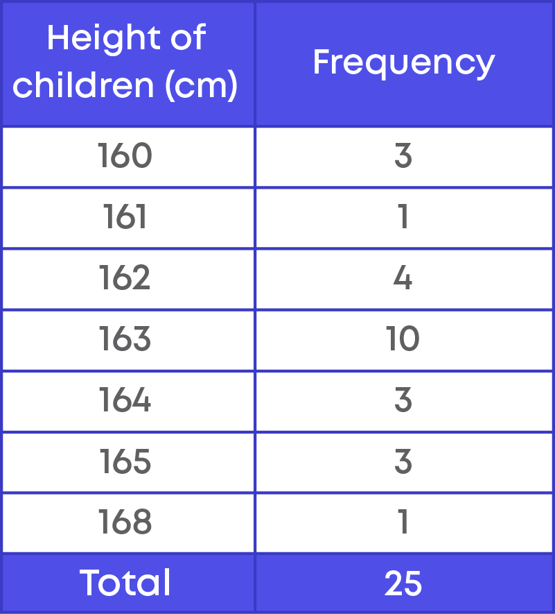
Step 2: Find out the observation which has the highest frequency.
Looking at the table, we can quickly say that 163 has occurred the maximum number of times. Hence, 163 is the ‘mode’. Hence, the mode of the heights is 163.
To solve problems based on mode we can use the following steps:
Step 1: Read through the problem carefully.
Step 2: Write down the details given in the question and think through what is being asked.
Step 3: Check for the data that is occurring maximum times.
Common Errors
The following are topics in which students make common mistakes when dealing with statistics:
- 1. Inclusive form and Exclusive form frequency distribution.
- 2. Identify the class interval or group to which the observation belongs.
- 3. Significance of broken line or kink in Histogram.
- 4. Arrange the data in ascending or descending order to find the median.
- 5. Data set can have more than one mode.
Identify The Class Interval Or Group To Which The Observation Belongs
While preparing a grouped distribution table remember this:
An observation 30 will not fall under the class interval 20 – 30. It will fall under the class interval 30 – 40.
Significance Of Broken Line Or Kink In Histogram
In a histogram, a broken line should be used along the horizontal line to indicate that we cannot show all the numbers from zero to the lower limit of the first-class interval of the given data.
For example: The following table shows the weights of children.
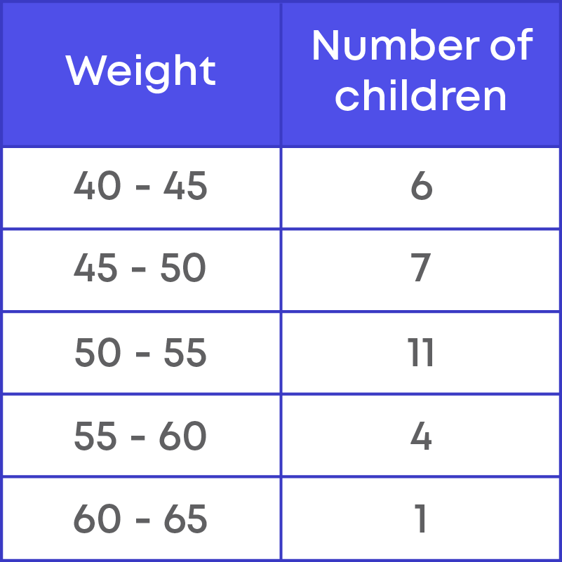
Here, we are not showing the data between 0 kg to 40 kg. Hence, there should be a broken line along the horizonal line.
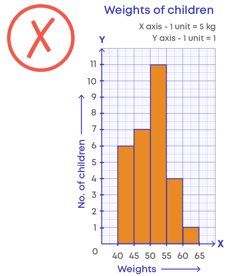
We follow this broken line or kink in frequency polygon also.
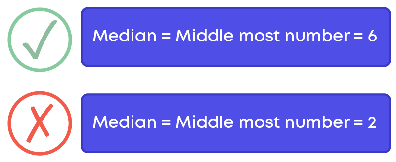
Arrange The Data In Ascending Or Descending Order To Find The Median.
While calculating median for a data set, the first important step is to arrange the data in ascending or descending order. Then find the median.
If the observations are not arranged in ascending or descending order, we will get the wrong median of the given data set.
For example: 3, 4, 6, 2, 9, 11, 7
To find the median of the data set, let us arrange the observation in ascending order:
2, 3, 4, 6, 7, 9, 11
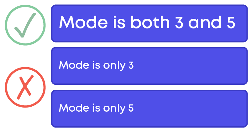
Data Set Can Have More Than One Mode.
While calculating mode for a data set, if two data points have the same highest frequency, then both the numbers will be the mode of the given data set.
For example: 3, 4, 6, 5, 4, 3, 7, 4, 3, 5, 6, 5, 5, 3
In the given data set, the numbers 3 and 5 occur 4 times, hence, the mode of the given data set is 3 and 5.
Conclusion
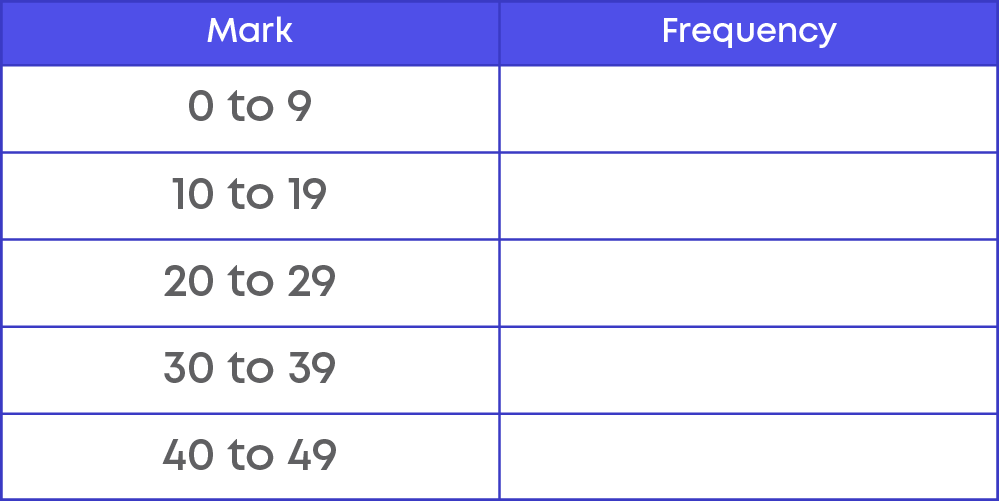
Can you solve this riddle based on statistics?
A Maths teacher collected the results from a test and recorded them as follows:
21, 27, 31, 6, 44, 26, 18, 5, 17, 25, 43, 22, 19, 11, 10, 20, 31, 41, 0, 7
Group them in the frequency table:

Arpana
Author
Arpana is an education specialist with years of teaching Math and developing content. She previously worked as a freelance content developer, developing lesson plans for a reputed publisher of text books and content for various educational companies. She is an enthusiastic teacher who has taught students from India, the UK, and New Zealand.